
Other Visual Design
Other Experiences
Other Experiences
Other Experiences
Other Experiences
Assorted visual design examples
Assorted visual design
Assorted visual design
Assorted visual design
Assorted visual design
ROLES: VISUAL DESIGN, ILLUSTRATION
TOOLS: ADOBE ILLUSTRATOR, SKETCHING, ADOBE AFTER EFFECTS
ROLES: VISUAL DESIGN, ILLUSTRATION
TOOLS: ADOBE ILLUSTRATOR, DRAWINGS BY HAND, ADOBE AFTER EFFECTS
ROLES: VISUAL DESIGN, ILLUSTRATION
TOOLS: ADOBE ILLUSTRATOR, DRAWINGS BY HAND, ADOBE AFTER EFFECTS
ROLES: VISUAL DESIGN, ILLUSTRATION
TOOLS: ADOBE ILLUSTRATOR, DRAWINGS BY HAND, ADOBE AFTER EFFECTS
ROLES: VISUAL DESIGN, ILLUSTRATION
TOOLS: ADOBE ILLUSTRATOR, DRAWINGS BY HAND, ADOBE AFTER EFFECTS
Infographics
Infographics
Infographics
Infographics bring delight to what would otherwise be dry numbers. Above (left to right) shows the full website graphic and two details (top and bottom).
Infographics bring delight to what would otherwise be dry numbers. Above (left to right) shows the full website graphic and two details (top and bottom).
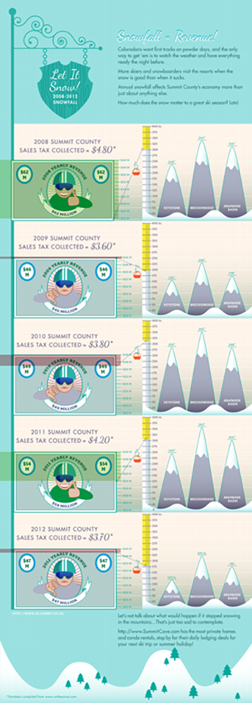
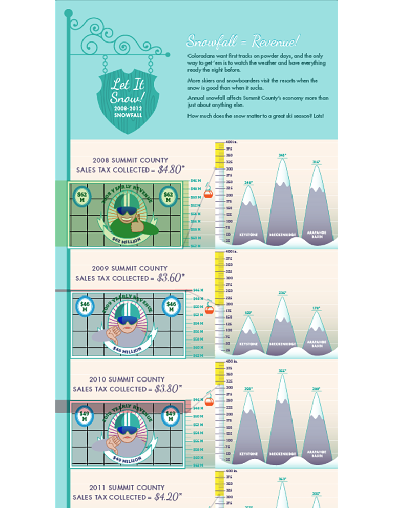
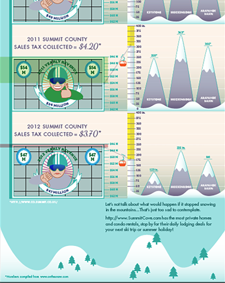
I designed this infographic for a digital article about the effects of snow amount on seasonal earnings of several Colorado ski resorts. Rather than subject viewers to written statistics, I used illustration to make dry information interesting and fun to take in. I used ski resort topics to stand in for graphs, ie: mountain heights represent snow fall amount. To the left of the moutains is the ski lift that heads up or down depending on the depth of snow. The clients were happy with the results.
I designed this infographic for a digital article about the effects of snow amount on seasonal earnings of several Colorado ski resorts. Rather than subject viewers to written statistics, I used illustration to make dry information interesting and fun to take in. I used ski resort topics to stand in for graphs, ie: mountain heights represent snow fall amount. To the left of the moutains is the ski lift that heads up or down depending on the depth of snow. The clients were happy with the results.
I designed this infographic for a digital article about the effects of snow amount on seasonal earnings of several Colorado ski resorts. Rather than subject viewers to written statistics, I used illustration to make dry information interesting and fun to take in. I used ski resort topics to stand in for graphs, ie: mountain heights represent snow fall amount. To the left of the moutains is the ski lift that heads up or down depending on the depth of snow. The clients were happy with the results.
I designed this infographic for a digital article about the effects of snow amount on seasonal earnings of several Colorado ski resorts. Rather than subject viewers to written statistics, I used illustration to make dry information interesting and fun to take in. I used ski resort topics to stand in for graphs, ie: mountain heights represent snow fall amount. To the left of the moutains is the ski lift that heads up or down depending on the depth of snow. The clients were happy with the results.
I designed this infographic for a digital article about the effects of snow amount on seasonal earnings of several Colorado ski resorts. Rather than subject viewers to written statistics, I used illustration to make dry information interesting and fun to take in. I used ski resort topics to stand in for graphs, ie: mountain heights represent snow fall amount. To the left of the moutains is the ski lift that heads up or down depending on the depth of snow. The clients were happy with the results.
Illustration
Illustration
Illustration
Illustration
Having a fine arts background allows me to illustrate my own spot illustrations. I have a range of styles both drawn by hand as well as digitally. So often I will be in need of illustrations showing specific subjects and can just draw them myself. This skill really comes in handy for sketching ideas to show clients and creating story-boards to show user flows, etc. So much faster than describing, especially to stakeholders who might not understand what you are proposing.
Having a fine arts background allows me to illustrate my own spot illustrations. I have a range of styles both drawn by hand as well as digitally. So often I will be in need of illustrations showing specific subjects and can just draw them myself. This skill really comes in handy for sketching ideas to show clients and creating story-boards to show user flows, etc. So much faster than describing, especially to stakeholders who might not understand what you are proposing.
Having a fine arts background allows me to illustrate my own spot illustrations. I have a range of styles both drawn by hand as well as digitally. So often I will be in need of illustrations showing specific subjects and can just draw them myself. This skill really comes in handy for sketching ideas to show clients and creating story-boards to show user flows, etc. So much faster than describing, especially to stakeholders who might not understand what you are proposing.
Having a fine arts background allows me to illustrate my own spot illustrations. I have a range of styles both drawn by hand as well as digitally. So often I will be in need of illustrations showing specific subjects and can just draw them myself. This skill really comes in handy for sketching ideas to show clients and creating story-boards to show user flows, etc. So much faster than describing, especially to stakeholders who might not understand what you are proposing.
Having a fine arts background allows me to illustrate my own spot illustrations. I have a range of styles both drawn by hand as well as digitally. So often I will be in need of illustrations showing specific subjects and can just draw them myself. This skill really comes in handy for sketching ideas to show clients and creating story-boards to show user flows, etc. So much faster than describing, especially to stakeholders who might not understand what you are proposing.
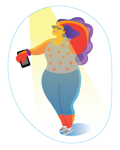
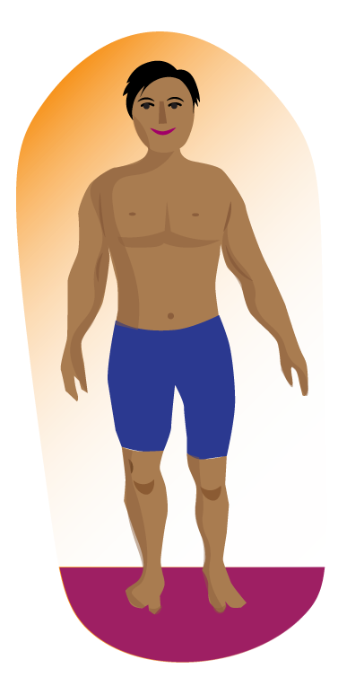
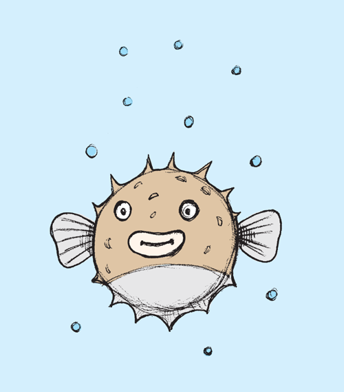

Here are a few styles I've used on past projects. (Clockwise) Spot illustration for activity tracker, body mass index, puffer fish, taco love, icons used in seasonal branding, animation.
Here are a few styles I've used on past projects. (Clockwise) Spot illustration for activity tracker, body mass index, puffer fish, taco love, icons used in seasonal branding, animation.
Here are a few styles I've used on past projects. (Clockwise) Spot illustration for activity tracker, body mass index, puffer fish, taco love, icons used in seasonal branding, animation.
Here are a few styles I've used on past projects. (Clockwise) Spot illustration subject on running, body mass index, taco love, mobile phone app, prism animation
Shown above are a few styles I've used on past projects. Above: Spot illustration subject on running, body mass index, taco love, mobile phone app, prism animation
Branding + Identity
Branding & Identity
Branding & Identity
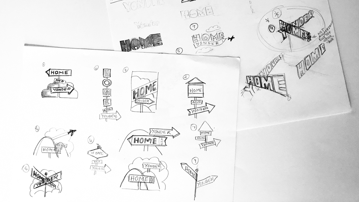
Sketching is the most important part of the process because it allows superfast ideation to focus on concept and not get bogged down with details. Shown are sketches for a logo I did.
Sketching is the most important part of the process because it allows superfast ideation to focus on concept and not get bogged down with details. Shown are sketches for a logo I did.
I usually start with typography when designing identity. I feel that typography can represent enough of a company or product's brand while still allowing the viewer to take part in the interpretation – unlike when using a literal image.
I usually start with typography when designing identity. I feel that typography can represent enough of a company or product's brand while still allowing the viewer to take part in the interpretation – unlike when using a literal image.
I usually start with typography when designing identity. I feel that typography can represent enough of a company or product's brand while still allowing the viewer to take part in the interpretation – unlike when using a literal image.
1
W
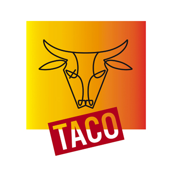
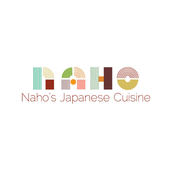
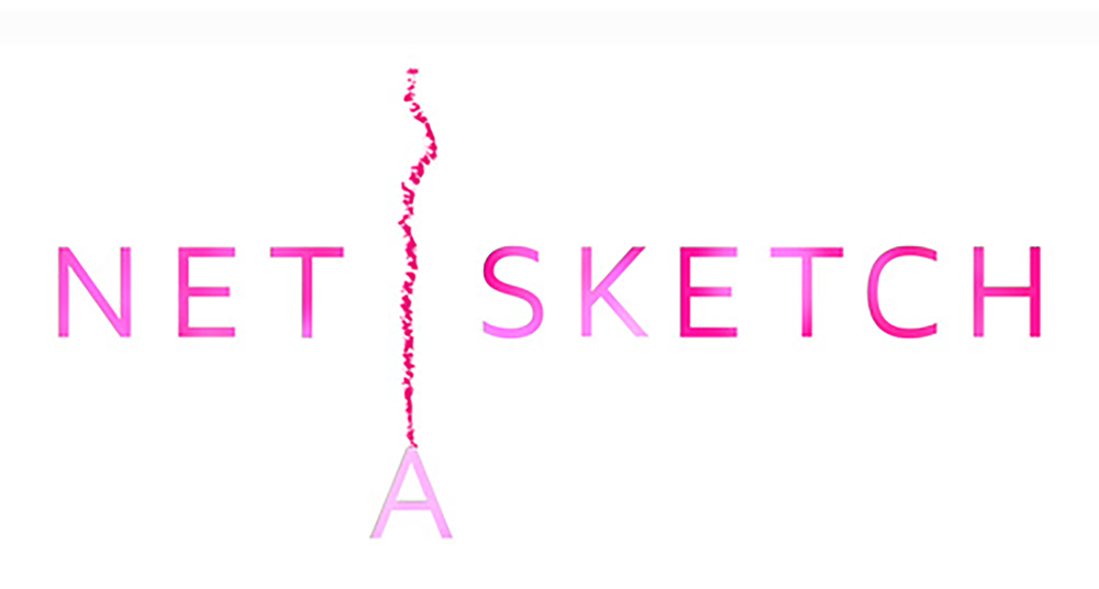
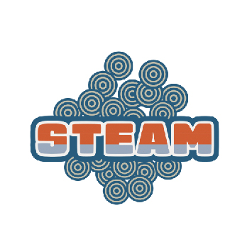
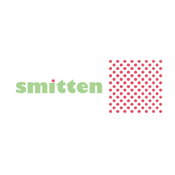
Some identities I've work on include (clockwise): Bullseye Taco – Taco stand restaurant (UO food court), Naho's Japanese Cuisine – A sushi chef and caterer, Net-A-Sketch – professional networking meet-up organization, Steam – Bao Bun stand (UO food court), Smitten – pastry stand (UO food court).
Some identities I've work on include (clockwise): Bullseye Taco – Taco stand restaurant (UO food court), Naho's Japanese Cuisine – A sushi chef and caterer, Net-A-Sketch – professional networking meet-up organization, Steam – Bao Bun stand (UO food court), Smitten – pastry stand (UO food court).
Some identities I've work on include (clockwise): Bullseye Taco, Naho's Japanese Cuisine, Net-A-Sketch – professional networking meet-up organization, Steam – Bao Bun stand (UO food court), Smitten – pastry stand (UO food court).
Some identities I've work on include (clockwise): Bullseye Taco – Taco stand restaurant (UO food court), Naho's Japanese Cuisine – A sushi chef and caterer, Net-A-Sketch – professional networking meet-up organization, Steam – Bao Bun stand (UO food court), Smitten – pastry stand (UO food court).
Type as Image
Type as Image
Type as Image
I am often hired to create images using typography. I like to allow the typeface inspire the design direction.
I am often hired to create images using typography. I like to allow the typeface inspire the design direction.
I'm often hired to create images using typography. I like to allow the typeface inspire the design direction.
I'm often hired to create images using typography. I like to allow the typeface inspire the design direction.
I'm often hired to create images using typography. I like to allow the typeface inspire the design direction.
On the left is a "Delft" style, decorative type used for a tongue-in-cheek take on a controversial subject.
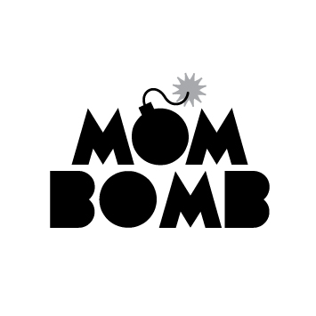
Mom Bomb was a type treatment used for hat embroidery. Mom Bomb celebrates moms.
On the left is a "Delft" style, decorative type used for a tongue-in-cheek take on a controversial subject.
Mom Bomb was a type treatment used for hat embroidery. Mom Bomb celebrates moms.
On the left is a "Delft" style, decorative type used for a tongue-in-cheek take on a controversial subject.
Mom Bomb was a type treatment used for hat embroidery. Mom Bomb celebrates moms.
On the left is a "Delft" style decorative approach is used for a controversial subject. This graphic became a tee shirt graphic.
Mom Bomb was a type treatment used for hat embroidery. Mom Bomb celebrates moms.
On the left is a "Delft" style decorative approach is used for a controversial subject. This graphic became a tee shirt graphic.
Mom Bomb was a type treatment used for hat embroidery. Mom Bomb celebrates moms.
Packaging
Packaging
Other
Other
Sometimes a client will come to me for help with visual design that collectively support the company's image while also standing alone as a product. In this project, a series of DIY kits needed to convey the individual products while holding together as a series. I worked with the client to create a template for all forthcoming kits. The challenge was taking into consideration the varied title lengths and diverse subject matter to find relevant imagery.
Sometimes a client will come to me for help with visual design that collectively support the company's image while also standing alone as a product. In this project, a series of DIY kits needed to convey the individual products while holding together as a series. I worked with the client to create a template for all forthcoming kits. The challenge was taking into consideration the varied title lengths and diverse subject matter to find relevant imagery.
Sometimes a client will come to me for help with visual design that collectively support the company's image while also standing alone as a product. In this project, a series of DIY kits needed to convey the individual products while holding together as a series. I worked with the client to create a template for all forthcoming kits. The challenge was taking into consideration the varied title lengths and diverse subject matter to find relevant imagery.
Sometimes a client will come to me for help with visual design that collectively support the company's image while also standing alone as a product. In this project, a series of DIY kits needed to convey the individual products while holding together as a series. I worked with the client to create a template for all forthcoming kits. The challenge was taking into consideration the varied title lengths and diverse subject matter to find relevant imagery.
Sometimes a client will come to me for help with visual design that collectively support the company's image while also standing alone as a product. In this project, a series of DIY kits needed to convey the individual products while holding together as a series. I worked with the client to create a template for all forthcoming kits. The challenge was taking into consideration the varied title lengths and diverse subject matter to find relevant imagery.
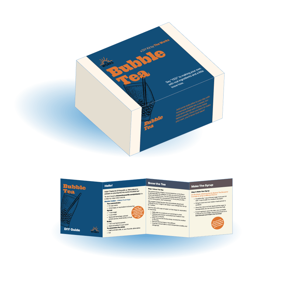
These Do It Yourself kits were designed as a series. They were designed to slide over the boxes.
All kits contained a mini instruction insert (shown below box).
These Do It Yourself kits were designed as a series. They were designed to slide over the boxes.
All kits contained a mini instruction insert (shown below box).
These Do It Yourself kits were designed as a series. They were designed to slide over the boxes.
All kits contained a mini instruction insert (shown below box).
These Do It Yourself kits were designed as a series. They were designed to slide over the boxes.
All kits contained a mini instruction insert (shown below box).
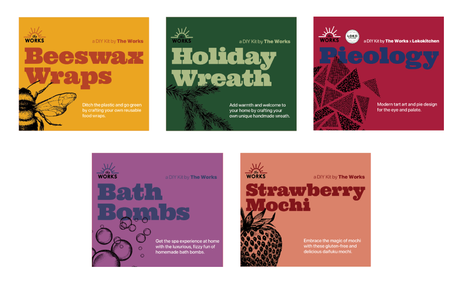
Each kit looks the same, with the text only changing when the title is long, like in the mochi kit.
Colors are important as well to convey the subject matter yet hold together when all kits are seen together.
Each kit looks the same, with the text only changing when the title is long, like in the mochi kit.
Colors are important as well to convey the subject matter yet hold together when all kits are seen together.
Each kit looks the same, with the text only changing when the title is long, like in the mochi kit.
Colors are important as well to convey the subject matter yet hold together when all kits are seen together.
Each kit looks the same, with the text only changing when the title is long, like in the mochi kit.
Colors are important as well to convey the subject matter yet hold together when all kits are seen together.
Each kit looks the same, with the text only changing when the title is long, like in the mochi kit.
Colors are important as well to convey the subject matter yet hold together when all kits are seen together.
Each kit looks the same, with the text only changing when the title is long, like in the mochi kit.
Colors are important as well to convey the subject matter yet hold together when all kits are seen together.
BACK TO
GO BACK TO