
Partner Vaccine Verification App
Puget Soundkeeper
Puget Soundkeeper
Puget Soundkeeper
Puget Soundkeeper
S4 Internal-facing App Design
Website Redesign
Website Redesign
Website Redesign
CLIENT: STARBUCKS
ROLES: UX/UI DESIGN, INTERACTION DESIGN, USER RESEARCH, USER TESTING, WIRE-FRAMING, PROTOTYPE DESIGN, INFORMATION ARCHITECTURE
TOOLS: FIGMA, MIRO, SLACK, JIRA/CONFLUENCE, MS OFFICE, MS TEAMS
TIMELINE: 10-WEEKS
MY ROLES: UI + UX DESIGN, USER RESEARCH, INFO ARCHITECTURE,
PROTOTYPE + WIREFRAME
TOOLS: ILLUSTRATOR, FIGMA, SKETCH, MIRO, OPTIMAL WORKSHOP
TIMELINE: 10-WEEKS
MY ROLES: UI + UX DESIGN, USER RESEARCH, INFO ARCHITECTURE,
PROTOTYPE + WIREFRAME
TOOLS: ILLUSTRATOR, FIGMA, SKETCH, MIRO, OPTIMAL WORKSHOP
TIMELINE: 10-WEEKS
MY ROLES: UI + UX DESIGN, USER RESEARCH, INFO ARCHITECTURE,
PROTOTYPE + WIREFRAME
TOOLS: ILLUSTRATOR, FIGMA, SKETCH, MIRO, OPTIMAL WORKSHOP
“Nobody expects the Spanish Inquisition!”
“What does 66,000 lbs. even mean? It’s nice to have facts if you can put them into context.”
“What does 66,000 lbs. even mean? It’s nice to have facts if you can put them into context.”
“What does 66,000 lbs. even mean? It’s nice to have facts if you can put them into context.”
— MONTY PYTHON
“What does 66,000 lbs. even mean? It’s nice to have facts if you can put them into context.”
“What does 66,000 lbs. even mean? It’s nice to have facts if you can put them into context.”
“What does 66,000 lbs. even mean? It’s nice to have facts if you can put them into context.”
GLOBAL PANDEMIC 101
In early 2020, nobody could have predicted that a global pandemic would disrupt lives and livelihoods forcing governments, businesses and individuals to rapidly adapt in unprecedented ways. That's why, when the government mandated that employees formally report their Covid-19 vaccine status in fall of 2021, we created an app to do just that.
The app is one in a suite of self-service S4 apps that securely deliver data to business users for use on data-sensitive tasks by managing, tracking and maintaining internal business and partner information. It's called “Partner Vaccine Verification” and designed for employees to document their vaccine status.
This app initially began as a single page of instruction – a wall of words.
DRINKABLE, SWIMMABLE, FISHABLE WATER FOR ALL
Puget Sound's uncommon natural beauty, with its sparkling water makes it an awesome place to live for humans and creatures alike… but not when it's polluted.
Puget Soundkeeper is a Seattle-based, non-profit organization that focuses on protecting the marine environment of Puget Sound and its tributaries. They monitor and mitigate pollution through prevention, advocacy, and enforcement programs.
Initially, the entire app began as a single page – too much to take in all at once.
The original Puget Soundkeeper landing page was confusing. Main navigation is at the middle of the home page making it difficult to find. There is too much to figure out before even understanding what Puget Soundkeeper does.
The original Puget Soundkeeper landing page was confusing. Main navigation is at the middle of the home page making it difficult to find. There is too much to figure out before even understanding what Puget Soundkeeper does.
The original Puget Soundkeeper landing page was confusing. Main navigation is in the middle of the home page making it difficult to find. There is too much to figure out before even understanding what Puget Soundkeeper is/does.
The original Puget Soundkeeper landing page was confusing. Main navigation is at the middle of the home page making it difficult to find. There is too much to figure out before even understanding what Puget Soundkeeper does.
How might we make the process easier to understand and use to reduce the high number of support tickets?
Research Question: How might we make Puget Soundkeeper’s website more engaging and easier to explore?
How might we make Puget Soundkeeper’s website more engaging and easier to explore?
How might we make Puget Soundkeeper’s website more engaging and easier to explore?
BOOSTING EMPATHY
The single-page format was too much to take in at one sitting. A pandemic is scary enough, and a government mandate putting one's livelihood at risk made it even scarier. It's intimidating, users are required to check off three lengthy attestation agreements in order to submit. Being sensitive to the vulnerability a user might feel can help calm fears and gain trust, giving users a sense of control.
To do this, I started with the following ideas:
- Create an introduction, a “handshake,” before asking users to divulge their personal information
- Explain the purpose in normal, everyday language and let the users know what to expect
- Humanize the interaction by adding a more conversational writing tone
- Let the user know how long it will take to complete the process, and give them the ability to come back mid-completion
- Confirm process completion
- Allow users to save a copy
PAIN POINTS
• The current 50 – 60% average visitor bounce-rate must be reduced. Visitors have to stay on the site to understand Soundkeeper’s work, and make online donations to support it. This is critical because Puget Soundkeeper relies heavily on donations both through financial form and volunteer action.
• Better organization of information is needed to improve user experience
• Information should be presented in a more engaging, visual way
• They need a way to handle the current amount of information and archive older content.
• They need to make technical information more accessible for community members.
• The current Puget Soundkeeper site doesn’t convey the passion or energy reflected in the organization or people who work there.
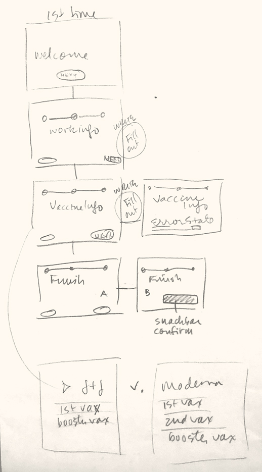
A problem visualized is a problem halved. Pencil sketches are always helpful in unraveling the many variables.
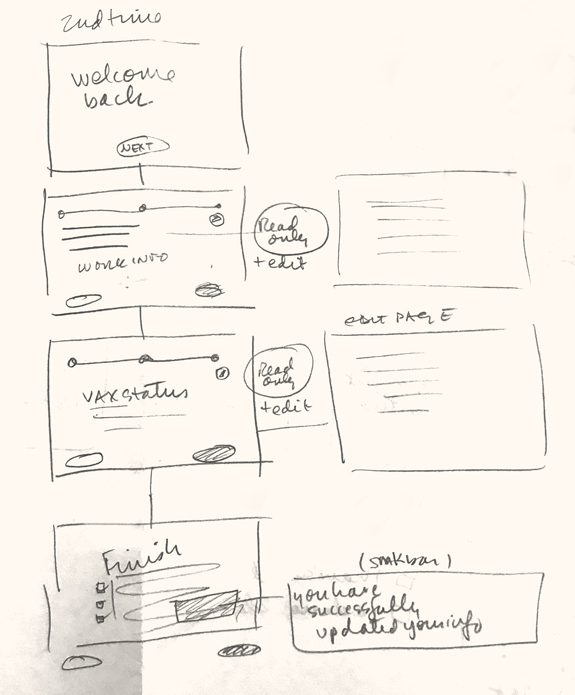
Shown here is the first visit (left) and second visit (right) input flow.
The original Puget Soundkeeper landing page was confusing. Main navigation is at the middle of the home page making it difficult to find. There is too much to figure out before even understanding what Puget Soundkeeper does.
The original Puget Soundkeeper landing page was confusing. Main navigation is at the middle of the home page making it difficult to find. There is too much to figure out before even understanding what Puget Soundkeeper does.
The original Puget Soundkeeper landing page was confusing. Main navigation is in the middle of the home page making it difficult to find. There is too much to figure out before even understanding what Puget Soundkeeper is/does.
The original Puget Soundkeeper landing page was confusing. Main navigation is at the middle of the home page making it difficult to find. There is too much to figure out before even understanding what Puget Soundkeeper does.
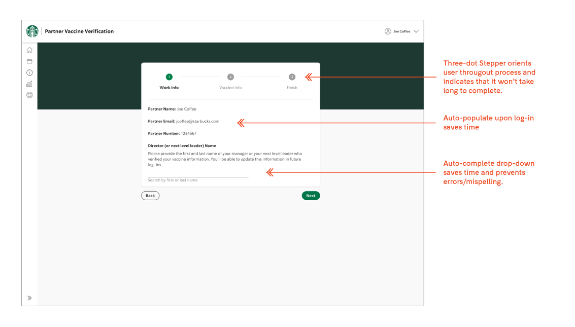
Having all vaccine information on one page was daunting. I proposed dividing the app into separate pages to make the process easier to digest. I created three pages: Introduction, vaccination details/attestations, and confirmation/review.
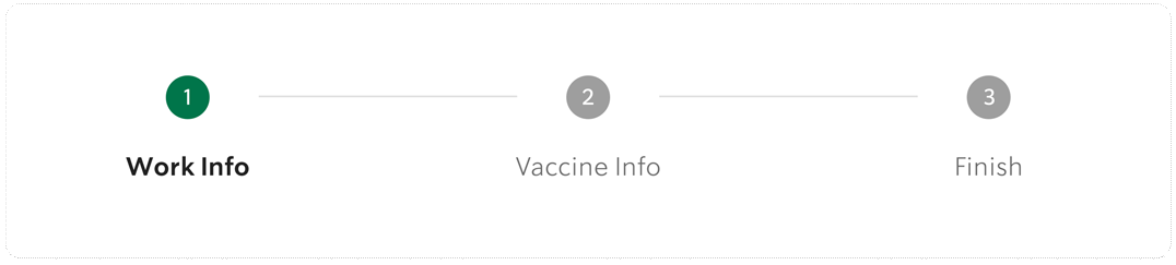
The Stepper Navigation orients users to where they are in the process and insinuates how long to complete. All dots start as grey with grey words until user moves to next step, then it turns green with black words and the number changes to a checkmark.
The original Puget Soundkeeper landing page was confusing. Main navigation is at the middle of the home page making it difficult to find. There is too much to figure out before even understanding what Puget Soundkeeper does.
The original Puget Soundkeeper landing page was confusing. Main navigation is at the middle of the home page making it difficult to find. There is too much to figure out before even understanding what Puget Soundkeeper does.
The original Puget Soundkeeper landing page was confusing. Main navigation is in the middle of the home page making it difficult to find. There is too much to figure out before even understanding what Puget Soundkeeper is/does.
The original Puget Soundkeeper landing page was confusing. Main navigation is at the middle of the home page making it difficult to find. There is too much to figure out before even understanding what Puget Soundkeeper does.
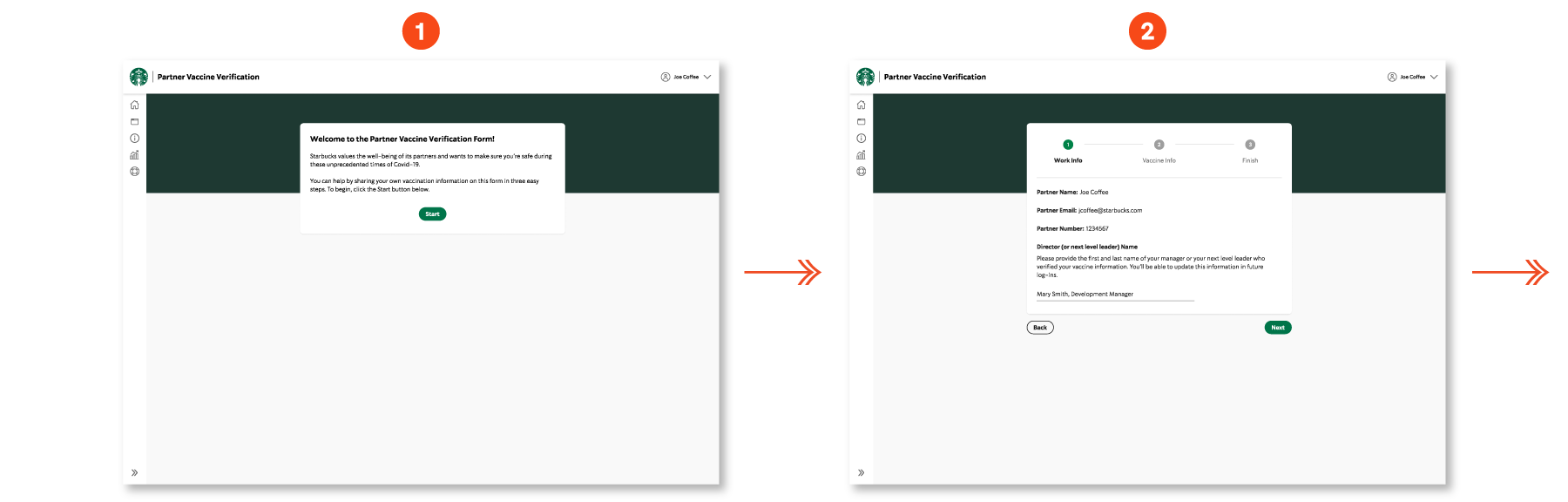
WELCOME TO THE PARTNER VACCINE VERIFICATION FORM!
Here's how it functions:
FIRST TIME VISIT
FIRST VISIT
1) Welcome/Intro Page
When users logs in, they see a welcome page that gives a short overview of the purpose for the app. The writing is friendly and conversational. They begin by clicking on the “Start” button. This takes them to Work Info, the first step of three.
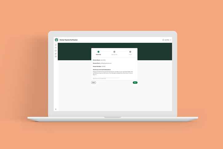
2) Step 1: Work Info
The user's work information is automatically input when they initially log in. Instructions to input the name of user's manager displays above the input field. Before entering the manager name, the input field is labeled below it with instructions to search by first or last name of manager. An auto-complete drop-down displays for Manager selection along with their titles. This way errors are avoided in case there are duplicate names. When finished, the user has the option to proceed to the next step or go back.
The original Puget Soundkeeper landing page was confusing. Main navigation is at the middle of the home page making it difficult to find. There is too much to figure out before even understanding what Puget Soundkeeper does.
The original Puget Soundkeeper landing page was confusing. Main navigation is at the middle of the home page making it difficult to find. There is too much to figure out before even understanding what Puget Soundkeeper does.
The original Puget Soundkeeper landing page was confusing. Main navigation is in the middle of the home page making it difficult to find. There is too much to figure out before even understanding what Puget Soundkeeper is/does.
The original Puget Soundkeeper landing page was confusing. Main navigation is at the middle of the home page making it difficult to find. There is too much to figure out before even understanding what Puget Soundkeeper does.
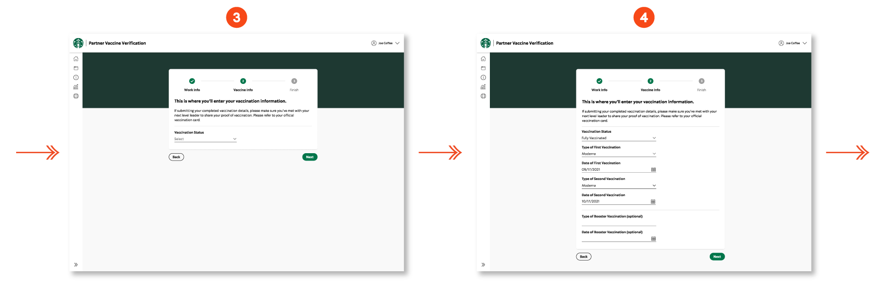
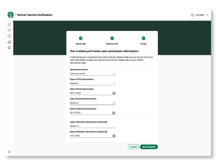
3 + 4) Step 2: Vaccine Info
There is a title at the top of each step that explains the purpose and instructions. A single drop-down field appears with instructions to “Select” vaccine status. User can select fully or single vaccinated, or not vaccinated. Once user inputs the type of vaccine, it designates either single or double-dose entry fields with corresponding dates. When user selects vaccine type, only input fields relevant to that become available (single-dose v. double). Drop-down menus prevent user errors or misspellings for efficiency.
When finished, user can go back or proceed to the next step.
When calendar icon is selected, a date picker component to aid in accurate timeframe input. It won't allow a date input before the required length of time between the first and second vaccinations (unless dealing with single dose vaccination). If user tries to input a date before the waiting period, a warning appears and the date picker highlights the error. As I was finishing the designs vaccine boosters became available, so I had to add an extra field for it. When finished, the user has the option to click on Back button or Next, taking them to the final step.
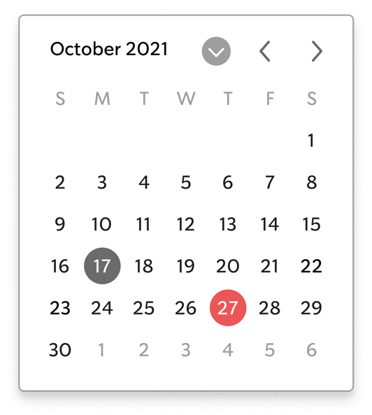
The date-picker component prevents user error by not allowing date input between vaccinations before before the official wait period. It highlights errors in red.
The original Puget Soundkeeper landing page was confusing. Main navigation is at the middle of the home page making it difficult to find. There is too much to figure out before even understanding what Puget Soundkeeper does.
The original Puget Soundkeeper landing page was confusing. Main navigation is at the middle of the home page making it difficult to find. There is too much to figure out before even understanding what Puget Soundkeeper does.
The original Puget Soundkeeper landing page was confusing. Main navigation is in the middle of the home page making it difficult to find. There is too much to figure out before even understanding what Puget Soundkeeper is/does.
The original Puget Soundkeeper landing page was confusing. Main navigation is at the middle of the home page making it difficult to find. There is too much to figure out before even understanding what Puget Soundkeeper does.
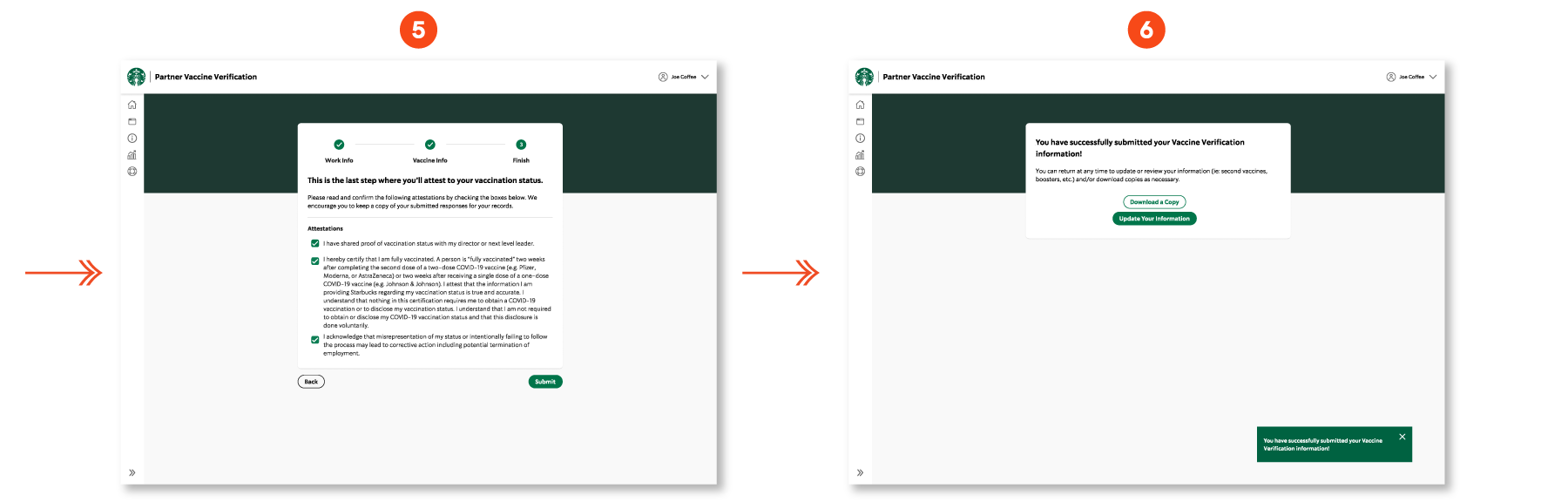
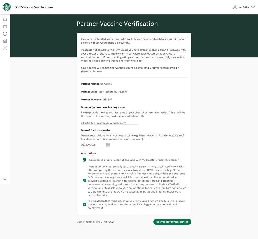
5) Step 3: Finish
In this last step the header explains along with instructions. User must click on all three attestations in order to complete their submission. At the end of the page they have the option to go back to previous step or to submit.
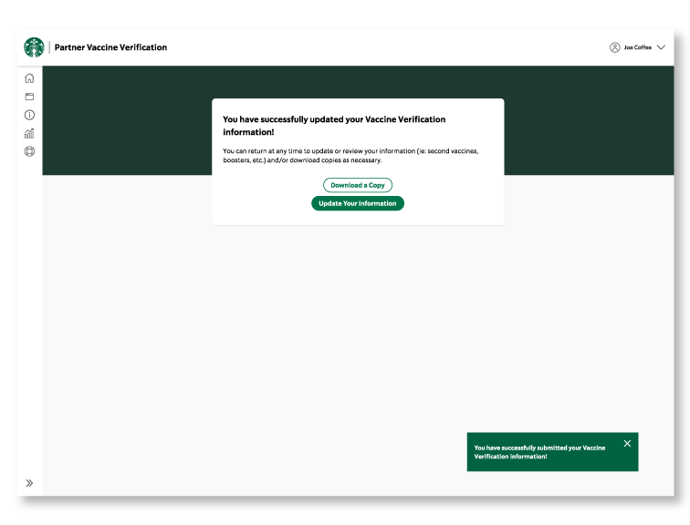
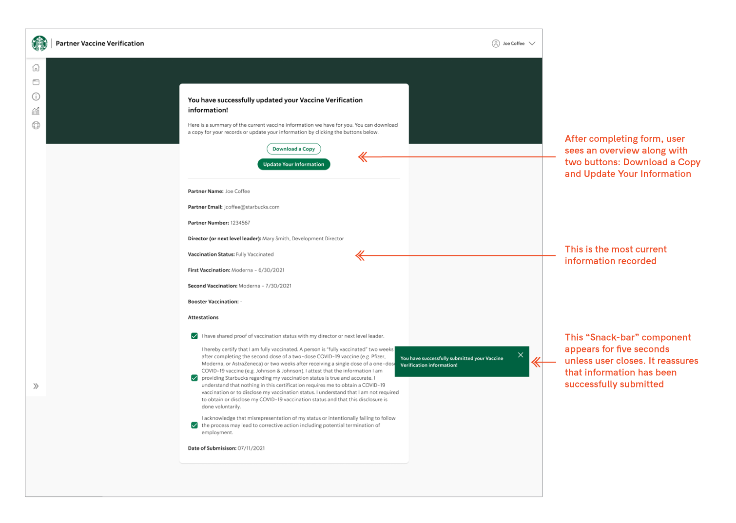
6) Confirmation Page
When the user successfully submits their vaccine status, a confirmation stating as such appears on the last page. There is instruction stating that they can come back at any time (resolving a previous pain point). There are two buttons that allow the viewer to download a copy or update their information. An additional “snack-bar” component pops up for five seconds on the bottom right.
Subsequent visit
Input from last visit
SECOND VISIT
There are many circumstances when users will need to update their information after their initial visit. So…
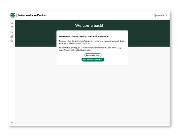
(Left) After the initial submission, subsequent visits recognize that fact. Logging in after the first time will take users to a page with the header: “Welcome Back!” Instead of a “Start” button, users will have the option of downloading a copy or updating their information.
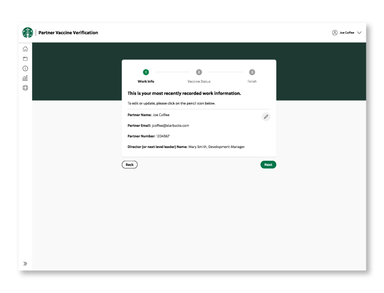
(Right) When they select the latter, they are taken to the Work Info page that shows the last input as read only. Users can edit this information by clicking on the pencil icon. They can choose to go back or click “Next” which takes them to the next steps as before.
Save updates
Confirmation
(Left) When revising or updating, the functionality is the same as in the first visit. Users have the option to cancel or save their updates – changes won’t be saved until they click on “Save Updates.”
(Right) Finish/Confirmation Page: “You have successfully updated your information!” displays at the top, and attestations remain as they were entered from first visit. The “snack-bar” component pops up again for five seconds. The user can return to save a copy or update their information as many times as needed. This fact helps the user know that they have control over their information.
A DOSE OF REALITY
After creating prototypes, I reviewed the designs with the rest of the team, running it by the developers to avoid engineering surprizes. Afterward, I tested the functionality on the target audience and invited a combination of Starbucks partners and District Managers to participate. There were five participants in total.
I designed interview questions to test the functionality and overall ease of use throughout the process. I wanted to understand the following:
1. Does the “Stepper” component make the process more intuitive?
2. Is the tone of writing non-intimidating?
3. Is it easy to understand and user interactions?
4. Is it easy to understand functions when returning after the first visit?
In these 30-minute virtual tests, participants were asked to navigate through a clickable prototype to input work and vaccination information. They were then asked to input their booster information to represent a second visit. All answers were determined with questions that used the Likert Scale.
MIGRATION OF DISCOVERY
The client identified several nonprofit sites that share a related mission: https://www.seashepherdglobal.org/ and https://theoceancleanup.com/rivers/. We used these two in our interviews as standards because they met the majority of the client’s benchmark goals.
We asked people in the Puget Sound area to evaluate the Puget Soundkeeper website and the other two sites and recorded their “thinking aloud” responses as they browsed them.
Regarding Puget Soundkeeper site:
1. When referring to technical information, context is necessary for understanding. 50% of participants said statistics are difficult to understand when you don’t have a context.
2. The home page is text-heavy, lacks variation in structure, and takes too much effort to figure out. Users don’t want to work to access information.
3. 47% found the page and site design to be unintuitive, cluttered, and confusing. 53% found the information unclear.
“Upbeat… very ‘Starbuckian’.”
“I want to read this, but I don’t want to work at it.”
“I want to read this, but I don’t want to work at it.”
“I want to read this, but I don’t want to work at it.”
— USER TESTER
— ANNA J.
— ANNA J.
— ANNA J.
YOUR TEST RESULTS ARE IN!
Here are some high level user testing discovery excerpts:
Overall Experience
- Loves how simple the interface is, needed minimal direction
- Experience feels very natural, very similar to other Starbuck applications
- Didn't overwhelm, straightforward, easy to nativage
Writing Style
- It didn't feel like a lot of information
- The tone of the writing style made filling out the form less intimidating or scary
- It’s very welcoming, very “us,” like we’re having a “coffee connect”
Ease of Understanding the Interaction
- Didn't have to mess around and click on multiple things before doing what was needed
- Grey and green color to indicate steps of the process was good, knew exactly where I was
- Several users wanted to see an overview of what they submitted before leaving the app. Other wise they'd have to log out of the app and into their Starbucks profile to check that it was submitted. Because of this, the confirmation message is a time saver.
In general
1. People are attracted to visual images and videos to help convey information quickly.
2. Typographic contrast and visual hierarchy aid in comprehension, allowing for quick scanning. 83% liked large headers, making content “scannable” for quick browsing.
3. Users want control over their experience, to come back to larger articles later.
4. 100% of them said they liked large, bold images, especially with motion. They said it kept their interest and made them want to dig deeper.
5. People want to be able to choose how much time they invest in articles. They want to scan articles by headers, and get just enough information to decide whether to read the rest, and when.
In general:
1. People are attracted to visual images and videos to help convey information quickly.
2. Typographic contrast and visual hierarchy aid in comprehension, allowing for quick scanning. 83% liked large headers, making content “scannable” for quick browsing.
3. Users want control over their experience, to come back to larger articles later.
4. 100% of them said they liked large, bold images, especially with motion. They said it kept their interest and made them want to dig deeper.
5. People want to be able to choose how much time they invest in articles. They want to scan articles by headers, and get just enough information to decide whether to read the rest, and when.
(Above) The results of the user testing confirmed the design decisions that led to a more efficient experience and greater sensitivity to the users.
The original Puget Soundkeeper landing page was confusing. Main navigation is at the middle of the home page making it difficult to find. There is too much to figure out before even understanding what Puget Soundkeeper does.
The original Puget Soundkeeper landing page was confusing. Main navigation is at the middle of the home page making it difficult to find. There is too much to figure out before even understanding what Puget Soundkeeper does.
The original Puget Soundkeeper landing page was confusing. Main navigation is in the middle of the home page making it difficult to find. There is too much to figure out before even understanding what Puget Soundkeeper is/does.
The original Puget Soundkeeper landing page was confusing. Main navigation is at the middle of the home page making it difficult to find. There is too much to figure out before even understanding what Puget Soundkeeper does.
Before testing, I had a moment of doubt about adding more pages to a single page app in order to simplify the process. It was counterintuitive, however, it turned out that users felt the overall experience was sensitive, respected their time, and prevented decision fatigue and errors.
After testing, I made minor adjustments and reviewed in detail with the developer working on this before handing it off.
SPAWNING SOLUTIONS
This is how we addressed these issues:
1. Distinct hierarchy. We structured a stronger hierarchy within the website with type and image, size contrast, typography, and color.
2. Simplify. We used the topics of importance from the client brief to create categories and subcategories. We started with 3 general categories. We then created 3 sub-categories for each of those. Content starts generally and gets more specific as the user continues.
3. Easy search. We created a prominent search bar with query suggestions and auto-complete to help visitors locate articles. People who sign up can save their articles by bookmarking. To prevent information crowding, we created an archive for older articles.
4. Scannability + user control. Articles are designed to be scanned. The user has control over their experience. They can just look at images and scan larger headers. They can read more in the moment or save for later.
5. Showing, not telling. We integrated friendly images to help explain technical information. This way technical information is made more accessible to the community.
6. Browsing beyond landing page. We created a visual narrative to draw in visitors. We also want to represent the passion and energy of Puget Soundkeeper.
“I think it’s intuitive, easy to use, easy to update.”
“Beautiful narrative approach that brings the issue back down to water.”
“Beautiful narrative approach that brings the issue back down to water.”
“Beautiful narrative approach that brings the issue back down to water.”
— USER TESTER
— DONIELLE STEVENS
Communications Manager, Puget Soundkeeper
— DONIELLE STEVENS
Communications Manager, Puget Soundkeeper
— DONIELLE STEVENS
Communications Manager, Puget Soundkeeper
— DONIELLE STEVENS
Communications Manager, Puget Soundkeeper
AN OUNCE OF PREVENTION
The most effective cure for a poor user experience is to prevent it in the first place. That's why using an iterative process combined with user feedback is so important.
FURTHER DOWNSTREAM
• With the tight timeline, and despite our best efforts, we weren't able to test the final design.
• Our team kept mobile in mind as we developed the site. Because of this, it would easily adapt to mobile.
• Due to the archive-heavy aspect of the site, a metadata tagging filter would be helpful to speed user search.
• With more time, I would create an interactive timeline/map that would showcase legal action stories, and show the connection of the lawsuits and grants benefiting communities. The timeline/map could reference grant details, results, and location of communities benefiting. This would be an engaging way for visitors to learn Puget Soundkeeper’s story and the positive impact they’ve made over the years.

“Every partner who filled out the form had a pleasurable experience.”
— PROJECT MANAGER
— DONIELLE STEVENS
Communications Manager, Puget Soundkeeper
— DONIELLE STEVENS
Communications Manager, Puget Soundkeeper
— DONIELLE STEVENS
Communications Manager, Puget Soundkeeper
— DONIELLE STEVENS
Communications Manager, Puget Soundkeeper
This project was very timely and important – it could potentially have serious impact on the user's livelihood. Making the process as transparent as possible contributes to giving the users a sense of control, and careful wording helps reduce apprehension.
Based on the responses of the users I have to say that not only were the initial issues resolved, but the experience was enhanced overall.
NEXT PROJECT
NEXT PROJECT
NEXT PROJECT
NEXT PROJECT
NEXT PROJECT