
Starbucks Retail Contact Tracing App
Puget Soundkeeper
Puget Soundkeeper
Puget Soundkeeper
Starbucks Retail Contact Tracing App
Starbucks S4 Web App
Website Redesign
Website Redesign
Website Redesign
TIMELINE: 6-WEEKS
ROLES: UI + UX DESIGN, USER RESEARCH, INTERACTION DESIGN, PROTOTYPE DESIGN, ILLUSTRATION, WIREFRAMING + SKETCHING
TOOLS: FIGMA, ADOBE ILLUSTRATOR, MIRO, MS TEAMS, JIRA, CONFLUENCE
TIMELINE: 10-WEEKS
MY ROLES: UI + UX DESIGN, USER RESEARCH, INFO ARCHITECTURE,
PROTOTYPE + WIREFRAME
TOOLS: ILLUSTRATOR, FIGMA, SKETCH, MIRO, OPTIMAL WORKSHOP
TIMELINE: 10-WEEKS
MY ROLES: UI + UX DESIGN, USER RESEARCH, INFO ARCHITECTURE,
PROTOTYPE + WIREFRAME
TOOLS: ILLUSTRATOR, FIGMA, SKETCH, MIRO, OPTIMAL WORKSHOP
TIMELINE: 6-WEEKS
ROLES: UI + UX DESIGN, USER RESEARCH, INTERACTION DESIGN, PROTOTYPE DESIGN, ILLUSTRATION, WIREFRAMING + SKETCHING
TOOLS: FIGMA, ADOBE ILLUSTRATOR, MIRO, MS TEAMS, JIRA, CONFLUENCE
DEJA VU
In March 2022, Starbucks prepared for the return to working on-site at the main office after two years of working remotely. In order to ensure the safety of all partners coming back to in-person work at the main headquarters. To do this, a contact tracing app was requested that would alert partners in the event that they’ve been exposed to someone with Covid.
After reviewing the project brief, I met with the stakeholder to understand the project scope in detail. The users were identified by the stakeholders as HR partners for non-retail whose responsibility it would be to alert employees potentially exposed by those testing Covid positive. The acceptance criteria were fairly straightforward:
Users needed a simple, easy-to-use app that would:
• Gather partner vaccination info of partners who have tested positive for Covid
• Alert workers who may have been exposed to Covid-19
• Allow users to save a copy in Excel
DRINKABLE, SWIMMABLE, FISHABLE WATER FOR ALL
Puget Sound's uncommon natural beauty, with its sparkling water makes it an awesome place to live for humans and creatures alike… but not when it's polluted.
Puget Soundkeeper is a Seattle-based, non-profit organization that focuses on protecting the marine environment of Puget Sound and its tributaries. They monitor and mitigate pollution through prevention, advocacy, and enforcement programs.
DEJA VU
In March 2022, Starbucks prepared for the return to working on-site at the main office after two years of working remotely. In order to ensure the safety of all partners coming back to in-person work at the main headquarters. To do this, a contact tracing app was requested that would alert partners in the event that they’ve been exposed to someone with Covid.
After reviewing the project brief, I met with the stakeholder to understand the project scope in detail. The users were identified by the stakeholders as HR partners for non-retail whose responsibility it would be to alert employees potentially exposed by those testing Covid positive. The acceptance criteria were fairly straightforward:
Users needed a simple, easy-to-use app that would:
• Gather partner vaccination info of partners who have tested positive for Covid
• Alert workers who may have been exposed to Covid-19
• Allow users to save a copy in Excel
Even though the user flow is relatively straight-forward, the functional evolution was not. Many adjustments to interactions organically came about during the design process.
The original Puget Soundkeeper landing page was confusing. Main navigation is at the middle of the home page making it difficult to find. There is too much to figure out before even understanding what Puget Soundkeeper does.
The original Puget Soundkeeper landing page was confusing. Main navigation is at the middle of the home page making it difficult to find. There is too much to figure out before even understanding what Puget Soundkeeper does.
The original Puget Soundkeeper landing page was confusing. Main navigation is in the middle of the home page making it difficult to find. There is too much to figure out before even understanding what Puget Soundkeeper is/does.
The original Puget Soundkeeper landing page was confusing. Main navigation is at the middle of the home page making it difficult to find. There is too much to figure out before even understanding what Puget Soundkeeper does.
How might we create an easy-to-use app to quickly identify partners testing positive for Covid and alert co-workers who were potentially exposed?
WHY REINVENT THE WHEEL?
I assumed this app would be stand-alone, like the others in the S4 suite. However, I remembered seeing an app with good interaction parameters that would solve for this new one – it allowed to search partner number, title, manager, etc. It was logical to use it as a starting point. Reusing patterns saves time for both designer and developers alike, translating into saving money for the team and Starbucks.
PUGET SOUNDKEEPER GOALS
• To inspire people to take action, volunteer, become a member, and donate
• Showcase the entire scope of work to illustrate their wide reach that extends beyond Seattle and King County
• Better organize of information in categories to reflect current programs
PUGET SOUNDKEEPER GOALS
• To inspire people to take action, volunteer, become a member, and donate
• Showcase the entire scope of work to illustrate their wide reach that extends beyond Seattle and King County
• Better organize of information in categories to reflect current programs
PUGET SOUNDKEEPER GOALS
• To inspire people to take action, volunteer, become a member, and donate
• Showcase the entire scope of work to illustrate their wide reach that extends beyond Seattle and King County
• Better organize of information in categories to reflect current programs
PUGET SOUNDKEEPER GOALS:
• To inspire people to take action, volunteer, become a member, and donate
• Showcase the entire scope of work to illustrate their wide reach that extends beyond Seattle and King County
• Better organize of information in categories to reflect current programs
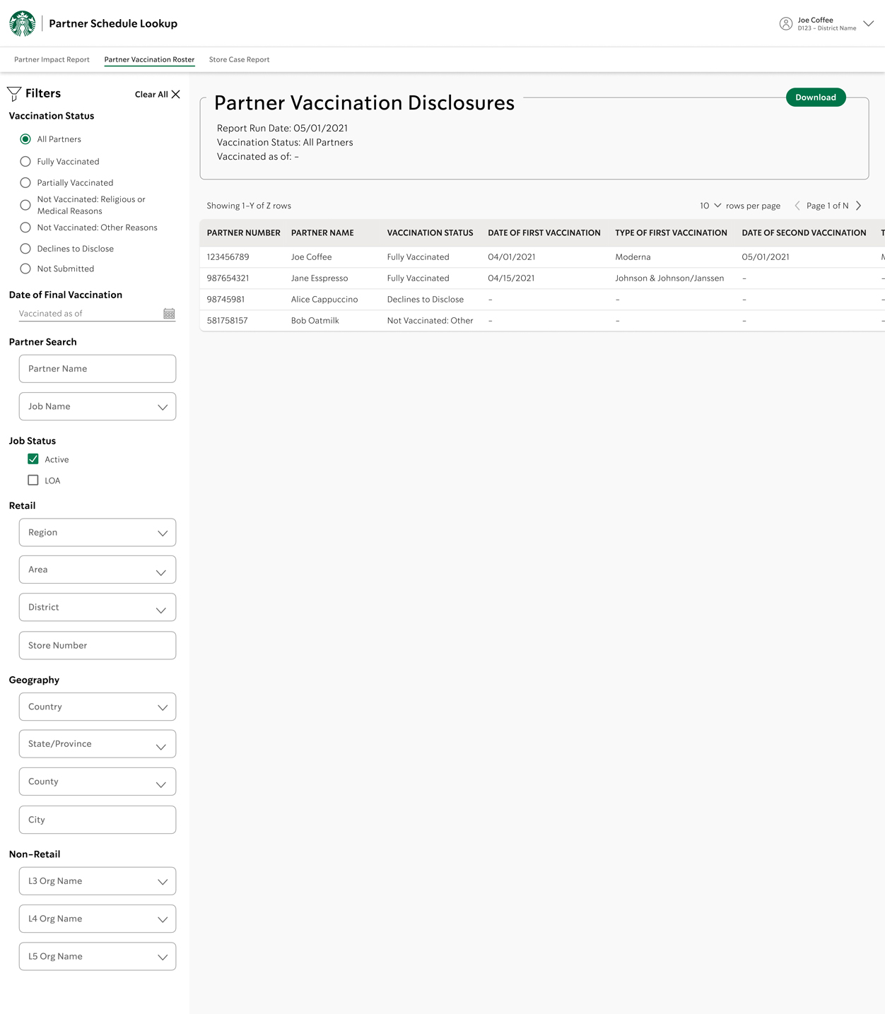
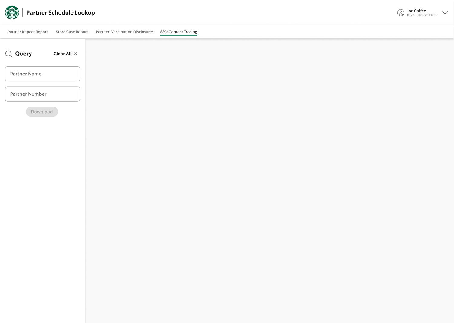
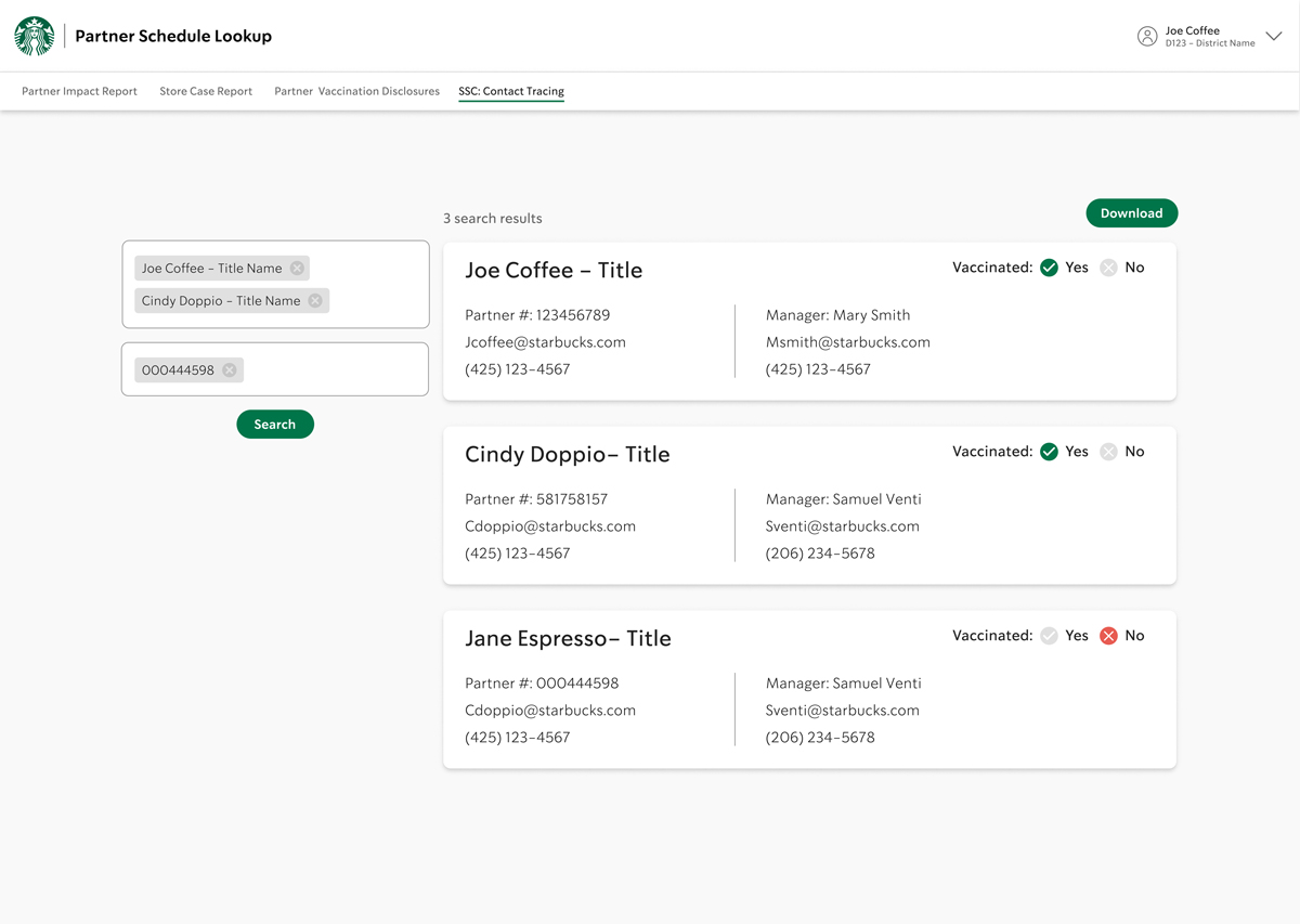
This is the existing app I used as a model, some of the functionality will be useful to recycle for the new app. Initially, I expected to use the same information as in the Vaccine Verification app (see case study).
The left side filters allow user to zero-in on partner details. The filter controls the right side display, along with having ability to download.
The original Puget Soundkeeper landing page was confusing. Main navigation is at the middle of the home page making it difficult to find. There is too much to figure out before even understanding what Puget Soundkeeper does.
The original Puget Soundkeeper landing page was confusing. Main navigation is at the middle of the home page making it difficult to find. There is too much to figure out before even understanding what Puget Soundkeeper does.
The original Puget Soundkeeper landing page was confusing. Main navigation is in the middle of the home page making it difficult to find. There is too much to figure out before even understanding what Puget Soundkeeper is/does.
The original Puget Soundkeeper landing page was confusing. Main navigation is at the middle of the home page making it difficult to find. There is too much to figure out before even understanding what Puget Soundkeeper does.
The new app’s primary function was as query search. User's simply needed to search whether partner's were vaccinated or not. They also needed to search for others working in close proximity who might have been exposed.
Unlike the Vaccine Verification form (see case study), this app relies on the voluntary we only needed to know whether a partner was vaccinated or not – no need for vaccine type, date or attestations. Either answer determined the recommended actions for partners who were potentially exposed. (i.e.: at this time, it was not required to self-isolate if you were double-vaccinated and boosted.
PUGET SOUNDKEEPER GOALS
• To inspire people to take action, volunteer, become a member, and donate
• Showcase the entire scope of work to illustrate their wide reach that extends beyond Seattle and King County
• Better organize of information in categories to reflect current programs
PUGET SOUNDKEEPER GOALS
• To inspire people to take action, volunteer, become a member, and donate
• Showcase the entire scope of work to illustrate their wide reach that extends beyond Seattle and King County
• Better organize of information in categories to reflect current programs
PUGET SOUNDKEEPER GOALS
• To inspire people to take action, volunteer, become a member, and donate
• Showcase the entire scope of work to illustrate their wide reach that extends beyond Seattle and King County
• Better organize of information in categories to reflect current programs
PUGET SOUNDKEEPER GOALS:
• To inspire people to take action, volunteer, become a member, and donate
• Showcase the entire scope of work to illustrate their wide reach that extends beyond Seattle and King County
• Better organize of information in categories to reflect current programs
At the time of designing this app, the CDC defined “close contact” as being within 6 feet proximity (of someone who tested Covid positive) for more than 20 minutes. This was how partner exposure was determined.
The original Puget Soundkeeper landing page was confusing. Main navigation is at the middle of the home page making it difficult to find. There is too much to figure out before even understanding what Puget Soundkeeper does.
The original Puget Soundkeeper landing page was confusing. Main navigation is at the middle of the home page making it difficult to find. There is too much to figure out before even understanding what Puget Soundkeeper does.
The original Puget Soundkeeper landing page was confusing. Main navigation is in the middle of the home page making it difficult to find. There is too much to figure out before even understanding what Puget Soundkeeper is/does.
The original Puget Soundkeeper landing page was confusing. Main navigation is at the middle of the home page making it difficult to find. There is too much to figure out before even understanding what Puget Soundkeeper does.
ADJUSTING DESIGN THINKING FOR BETTER SOLUTIONS
Since we only needed to search by partner name or number, the filter element was much more simplified than the original model app. The design team recently wanted to introduce slide-in filter component to future apps and this was to be a good opportunity to use it. I created a few variations to present to our design team.
PUGET SOUNDKEEPER GOALS
• To inspire people to take action, volunteer, become a member, and donate
• Showcase the entire scope of work to illustrate their wide reach that extends beyond Seattle and King County
• Better organize of information in categories to reflect current programs
PUGET SOUNDKEEPER GOALS
• To inspire people to take action, volunteer, become a member, and donate
• Showcase the entire scope of work to illustrate their wide reach that extends beyond Seattle and King County
• Better organize of information in categories to reflect current programs
PUGET SOUNDKEEPER GOALS
• To inspire people to take action, volunteer, become a member, and donate
• Showcase the entire scope of work to illustrate their wide reach that extends beyond Seattle and King County
• Better organize of information in categories to reflect current programs
PUGET SOUNDKEEPER GOALS:
• To inspire people to take action, volunteer, become a member, and donate
• Showcase the entire scope of work to illustrate their wide reach that extends beyond Seattle and King County
• Better organize of information in categories to reflect current programs
V1: RIGHT-HAND FILTER, WIDE
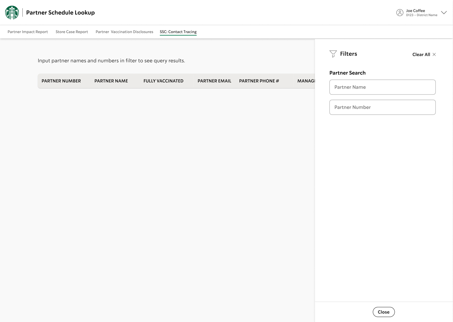
V2: RIGHT-HAND FILTER, NARROW
V3: LEFT-HAND FILTER, NARROW
I always like to offer design variations, like these filters.
The original Puget Soundkeeper landing page was confusing. Main navigation is at the middle of the home page making it difficult to find. There is too much to figure out before even understanding what Puget Soundkeeper does.
The original Puget Soundkeeper landing page was confusing. Main navigation is at the middle of the home page making it difficult to find. There is too much to figure out before even understanding what Puget Soundkeeper does.
The original Puget Soundkeeper landing page was confusing. Main navigation is in the middle of the home page making it difficult to find. There is too much to figure out before even understanding what Puget Soundkeeper is/does.
The original Puget Soundkeeper landing page was confusing. Main navigation is at the middle of the home page making it difficult to find. There is too much to figure out before even understanding what Puget Soundkeeper does.
CLOSER TO A SOLUTION
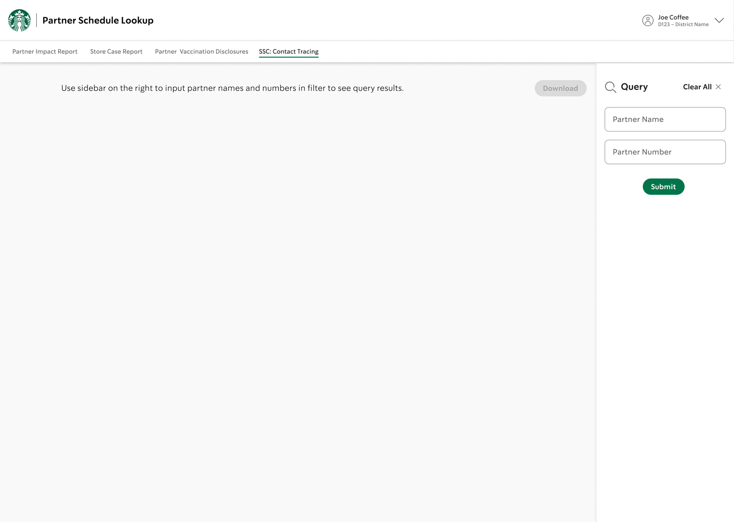
Before the design process gets too far along, I like to consult with the engineers. Feedback from developers can contribute to unexpected solutions, as was the case after showing my preliminary versions to a team developer. He introduced me to an interaction function from another app that had more usability potential for the new app than my initial direction. This led me to change the design for a smoother user process.
The new interaction was more straightforward, displaying query results within the page instead of previous versions where the user had to scroll horizontally.
HATCHING A STRATEGY
Our team analyzed the existing site to understand how it was failing. Why weren’t visitors getting beyond the landing page? As a team, we hypothesized:
• There’s a daunting amount of information on the homepage.
• The home page content lacks thoughtful hierarchy and organization.
• Past and present content are mixed. Older content should be archived.
• The visuals are not interesting.
• Navigation on the site does not follow best practices, so content is difficult to find.
HOME PAGE
1ST PARTNER NAME SEARCH
2ND PARTNER NAME SEARCH
PARTNER NUMBER SEARCH
The above shows the start of query function.
The original Puget Soundkeeper landing page was confusing. Main navigation is at the middle of the home page making it difficult to find. There is too much to figure out before even understanding what Puget Soundkeeper does.
The original Puget Soundkeeper landing page was confusing. Main navigation is at the middle of the home page making it difficult to find. There is too much to figure out before even understanding what Puget Soundkeeper does.
The original Puget Soundkeeper landing page was confusing. Main navigation is in the middle of the home page making it difficult to find. There is too much to figure out before even understanding what Puget Soundkeeper is/does.
The original Puget Soundkeeper landing page was confusing. Main navigation is at the middle of the home page making it difficult to find. There is too much to figure out before even understanding what Puget Soundkeeper does.
ACCESSIBILITY IN THE DETAILS
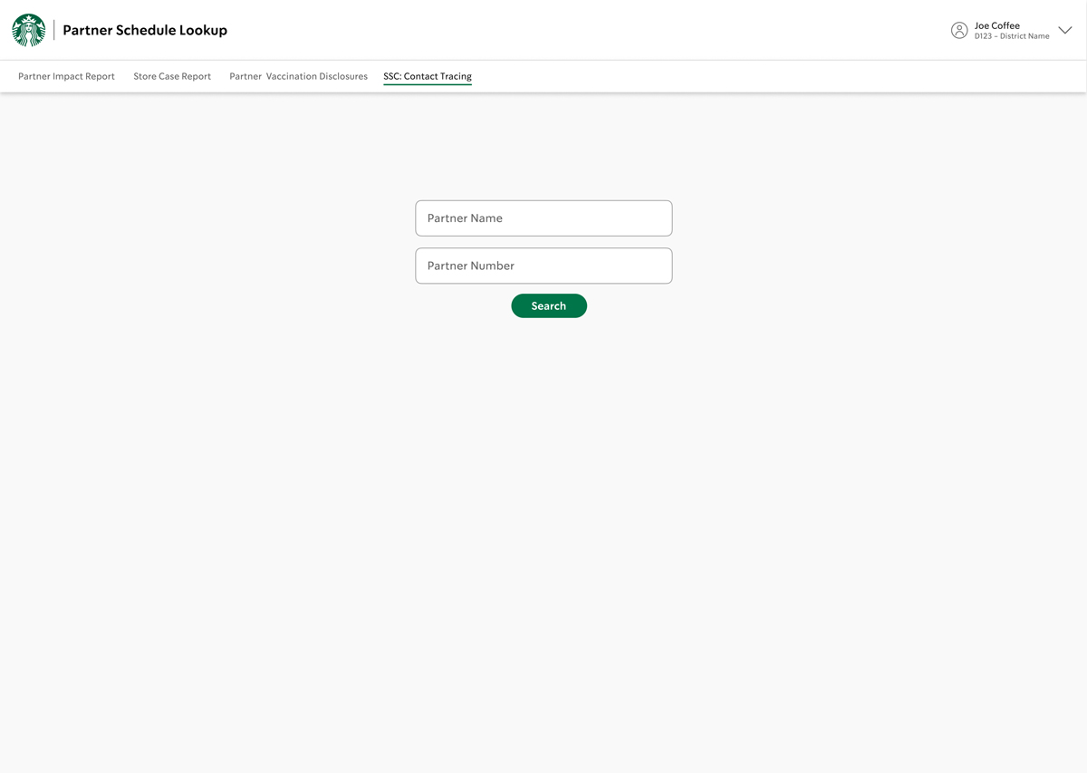
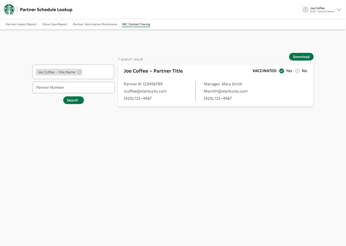
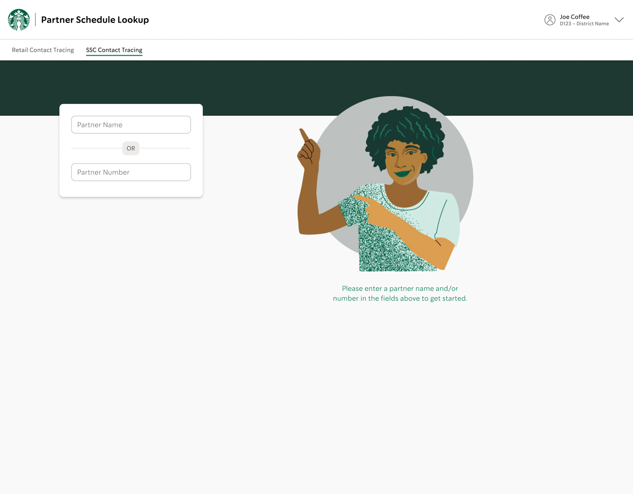
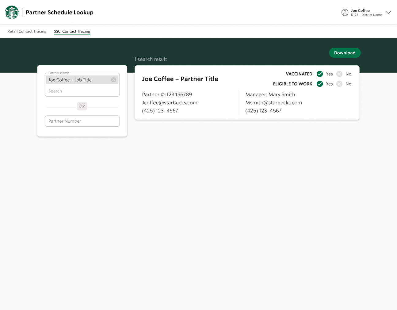
Users experience a fool-proof query search when they enter the home page. This is an existing query search design pattern in our S4 library that is used on other apps with similar requirements. To start the search, they enter either partner name or partner number. The search results will bring up a “card” that lists the partner information as well as their manager’s. Since the main information needed is partner name and knowing whether they are vaccinated, I emphasized that hierarchy by putting it at the top and in bolder text. The two radio buttons indicate whether partner is vaccinated or not through color, “green” and “red,” and reinforced for accessibility with the words “yes” or “no.”
The updated interaction was the best solution, however it looked awkward. Centering the input field on the first page was an existing standard, but seemed odd for it to move to the left after inputting search query. However, having the input field appear on the left leaves a large blank area in the center making it look unintentional, like something's missing.
HATCHING A STRATEGY
Our team analyzed the existing site to understand how it was failing. Why weren’t visitors getting beyond the landing page? As a team, we hypothesized:
• There’s a daunting amount of information on the homepage.
• The home page content lacks thoughtful hierarchy and organization.
• Past and present content are mixed. Older content should be archived.
• The visuals are not interesting.
• Navigation on the site does not follow best practices, so content is difficult to find.

Vaccination status is prominently placed at the top of each card. It is both color coded and reinforced with the words “yes” or “no” for accessibility.
The original Puget Soundkeeper landing page was confusing. Main navigation is at the middle of the home page making it difficult to find. There is too much to figure out before even understanding what Puget Soundkeeper does.
The original Puget Soundkeeper landing page was confusing. Main navigation is at the middle of the home page making it difficult to find. There is too much to figure out before even understanding what Puget Soundkeeper does.
The original Puget Soundkeeper landing page was confusing. Main navigation is in the middle of the home page making it difficult to find. There is too much to figure out before even understanding what Puget Soundkeeper is/does.
The original Puget Soundkeeper landing page was confusing. Main navigation is at the middle of the home page making it difficult to find. There is too much to figure out before even understanding what Puget Soundkeeper does.
“I appreciate that the illustrations add a human connection to the user experience.”
“What does 66,000 lbs. even mean? It’s nice to have facts if you can put them into context.”
“What does 66,000 lbs. even mean? It’s nice to have facts if you can put them into context.”
“What does 66,000 lbs. even mean? It’s nice to have facts if you can put them into context.”
— TEAM DEVELOPER
ILLUSTRATIONS
Around this time, our design team discussed adding illustrations into future projects. Illustrations soften technical processes as well as bring a human element and delight the user. I’m an illustrator too, so this app seemed like a great opportunity for this. Starbucks has an existing illustration style that aligns with the overall brand, so I had to keep that in mind when I created the new characters.
I came up with two characters for this contact tracing app. One character helps guide the user when they reach the home page by pointing in the direction of the entry field, and another is for error states. I also created a couple more characters to use in the future, with the intent that they would be the beginning of our S4 illustration library.
Since users see the illustration on the home page, it allowed me to keep the query filter position on the upper left side of the page, which was consistent to it's position in the query display state.
HATCHING A STRATEGY
Our team analyzed the existing site to understand how it was failing. Why weren’t visitors getting beyond the landing page? As a team, we hypothesized:
• There’s a daunting amount of information on the homepage.
• The home page content lacks thoughtful hierarchy and organization.
• Past and present content are mixed. Older content should be archived.
• The visuals are not interesting.
• Navigation on the site does not follow best practices, so content is difficult to find.
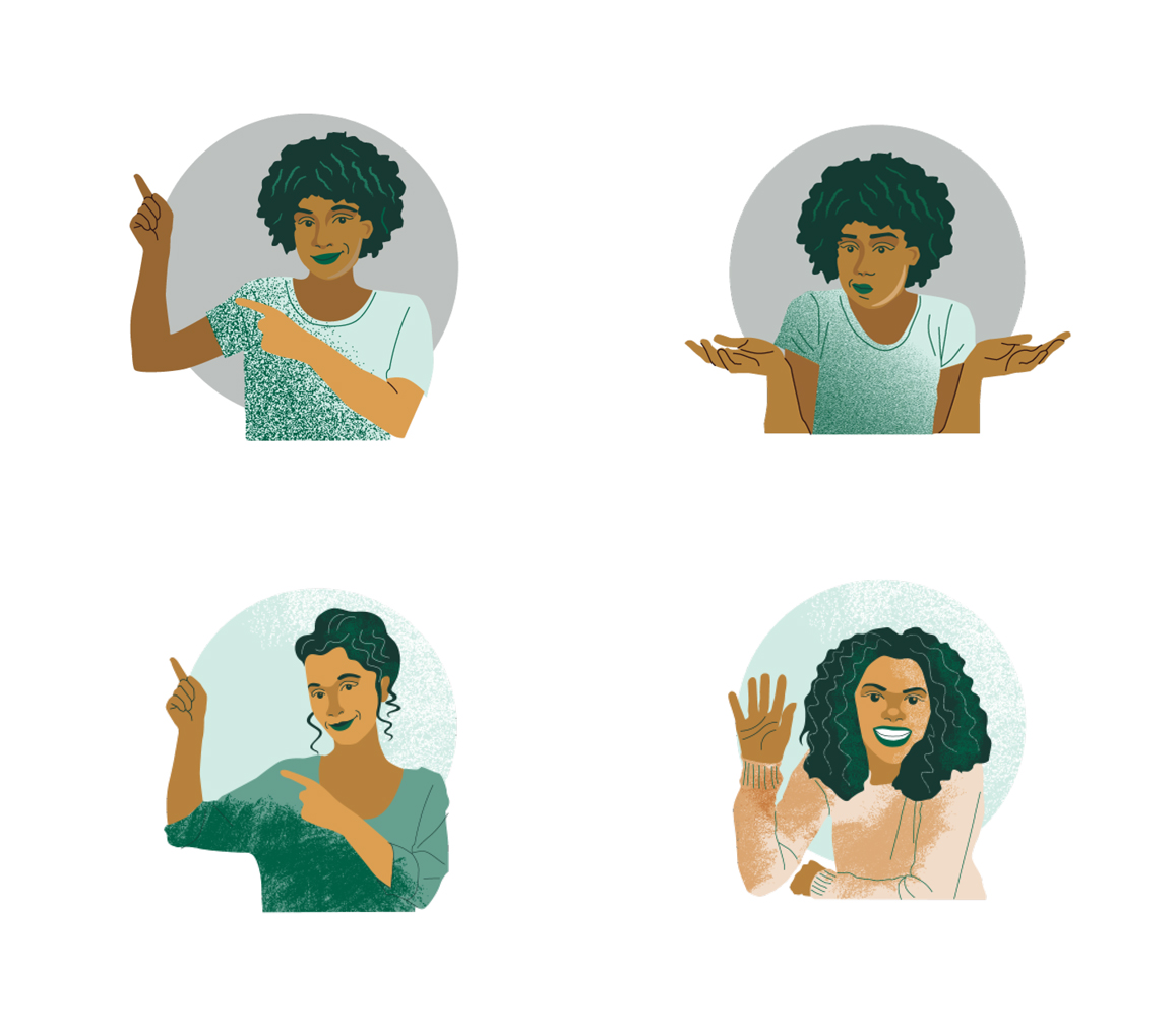
Illustrations add a human elelment and a touch of delight.
(Top row, left) Pointing to the first page input field
(Top row, right) Error state
(Bottom row) Alternative illustrations for future apps
The original Puget Soundkeeper landing page was confusing. Main navigation is at the middle of the home page making it difficult to find. There is too much to figure out before even understanding what Puget Soundkeeper does.
The original Puget Soundkeeper landing page was confusing. Main navigation is at the middle of the home page making it difficult to find. There is too much to figure out before even understanding what Puget Soundkeeper does.
The original Puget Soundkeeper landing page was confusing. Main navigation is in the middle of the home page making it difficult to find. There is too much to figure out before even understanding what Puget Soundkeeper is/does.
The original Puget Soundkeeper landing page was confusing. Main navigation is at the middle of the home page making it difficult to find. There is too much to figure out before even understanding what Puget Soundkeeper does.
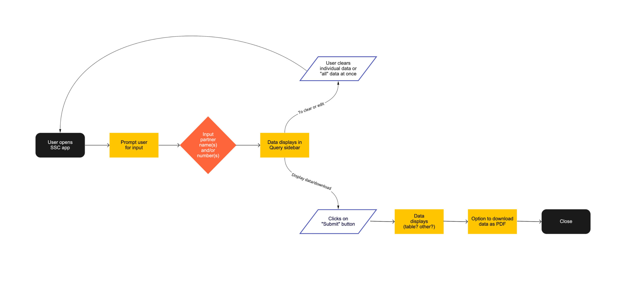
THE REALLY FINAL, FINAL VERSION
The final details incorporated new elements for consistency with the other newer apps (like the dark green bar), along with adding the illustrations. The diagram below shows the final flow broken into two halves, input queries and query deletion.
MIGRATION OF DISCOVERY
The client identified several nonprofit sites that share a related mission: https://www.seashepherdglobal.org/ and https://theoceancleanup.com/rivers/. We used these two in our interviews as standards because they met the majority of the client’s benchmark goals.
We asked people in the Puget Sound area to evaluate the Puget Soundkeeper website and the other two sites and recorded their “thinking aloud” responses as they browsed them.
Regarding Puget Soundkeeper site:
1. When referring to technical information, context is necessary for understanding. 50% of participants said statistics are difficult to understand when you don’t have a context.
2. The home page is text-heavy, lacks variation in structure, and takes too much effort to figure out. Users don’t want to work to access information.
3. 47% found the page and site design to be unintuitive, cluttered, and confusing. 53% found the information unclear.

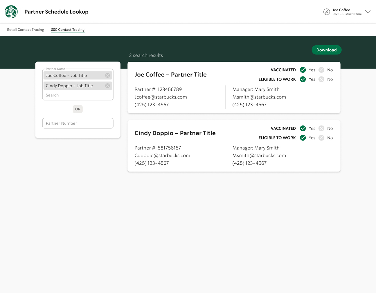
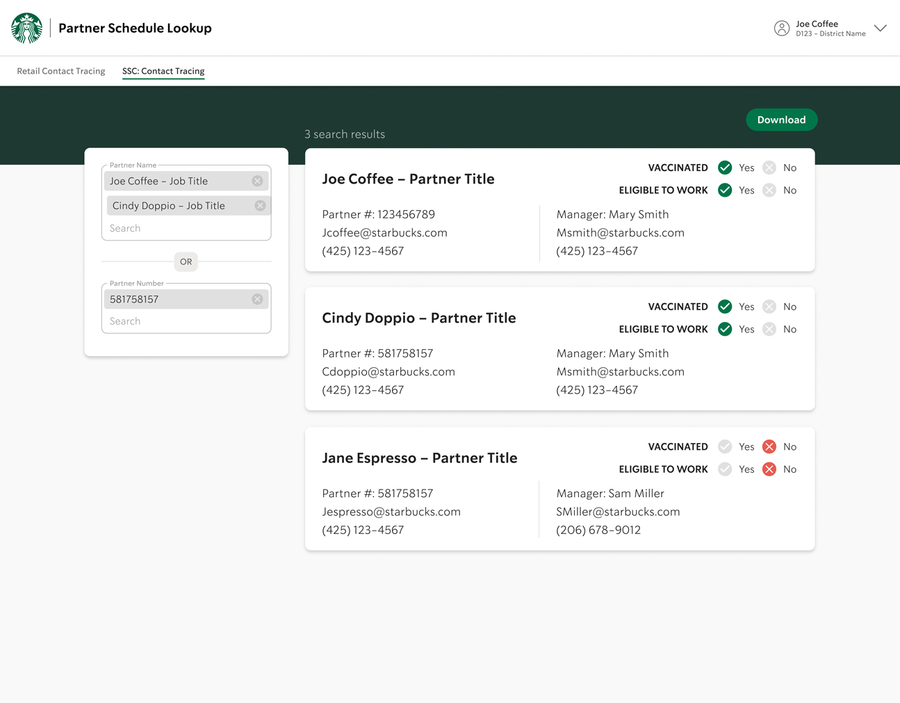
1ST PART: DATA ENTRY
Query entry field is adjusted for an “either/or” input by adding the “OR” divider component. The illustration makes the left-side placement of the entry field more purposeful, and directs the user by pointing in that direction.
The original Puget Soundkeeper landing page was confusing. Main navigation is at the middle of the home page making it difficult to find. There is too much to figure out before even understanding what Puget Soundkeeper does.
The original Puget Soundkeeper landing page was confusing. Main navigation is at the middle of the home page making it difficult to find. There is too much to figure out before even understanding what Puget Soundkeeper does.
The original Puget Soundkeeper landing page was confusing. Main navigation is in the middle of the home page making it difficult to find. There is too much to figure out before even understanding what Puget Soundkeeper is/does.
The original Puget Soundkeeper landing page was confusing. Main navigation is at the middle of the home page making it difficult to find. There is too much to figure out before even understanding what Puget Soundkeeper does.


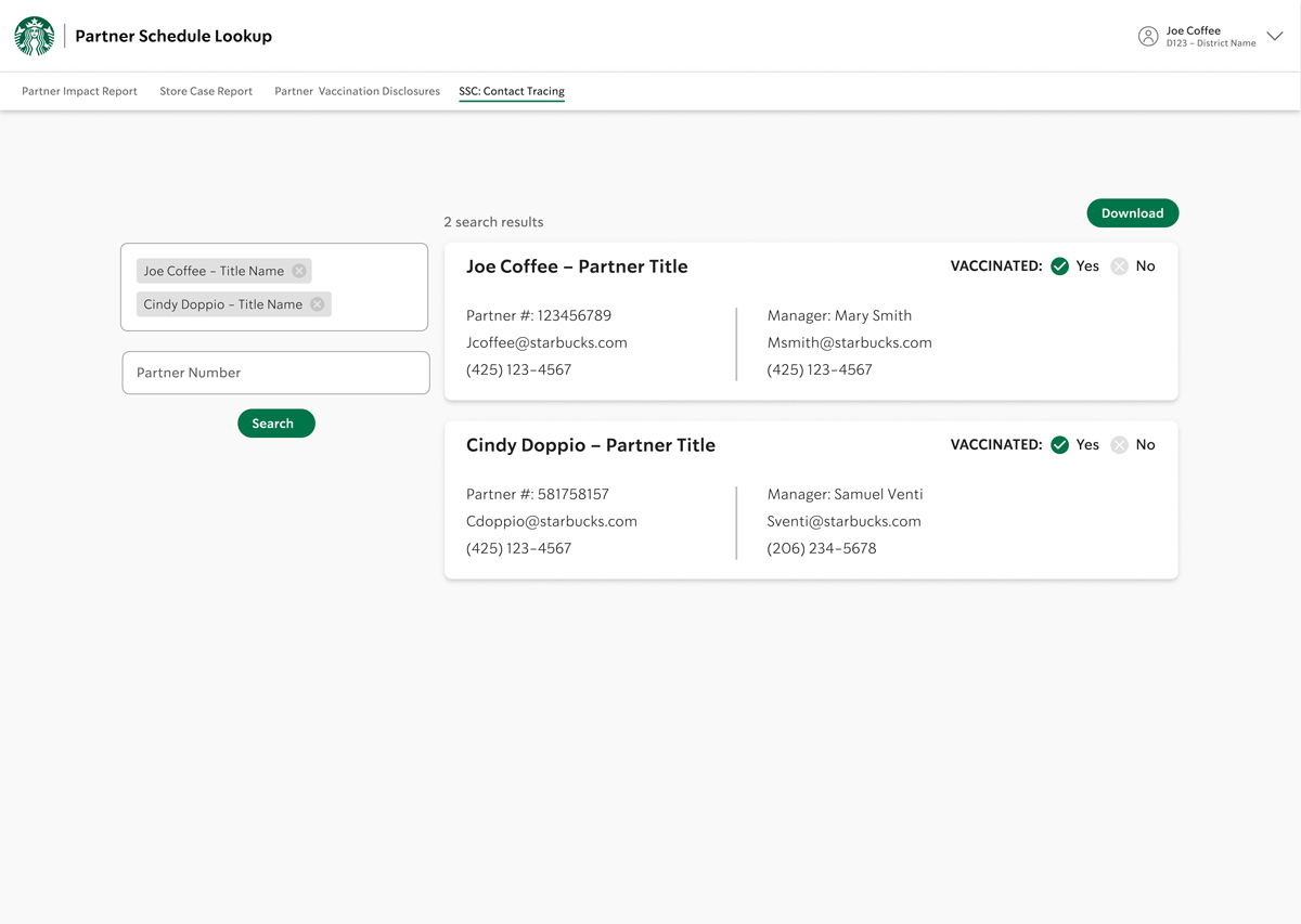
2ND PART: DATA EDITING
Users can edit their input by deleting the chips. They can also download their search results. If user deletes all input values, it takes them back to the beginning state.
The original Puget Soundkeeper landing page was confusing. Main navigation is at the middle of the home page making it difficult to find. There is too much to figure out before even understanding what Puget Soundkeeper does.
The original Puget Soundkeeper landing page was confusing. Main navigation is at the middle of the home page making it difficult to find. There is too much to figure out before even understanding what Puget Soundkeeper does.
The original Puget Soundkeeper landing page was confusing. Main navigation is in the middle of the home page making it difficult to find. There is too much to figure out before even understanding what Puget Soundkeeper is/does.
The original Puget Soundkeeper landing page was confusing. Main navigation is at the middle of the home page making it difficult to find. There is too much to figure out before even understanding what Puget Soundkeeper does.
USER TESTING & DEV HAND-OFF
To help explain the project flow details, I created a clickable, high fidelity prototype in Figma for user testing with the stakeholder and a couple team members who successfully completed the tests. Everyone enjoyed the addition of the illustrations, simplicity of use, and the communication throughout the app. They also appreciated that I paid attention to accessibility details.
Before meeting with the developer for hand off, I created user stories using the “CRUD” baseline to cover all four of the basic app functionality and added it to our Jira project log. I reviewed the Figma prototype with the developer before handing off.
“Good job incorporating team feedback.”
Research Question: How might we make Puget Soundkeeper’s website more engaging and easier to explore?
How might we make Puget Soundkeeper’s website more engaging and easier to explore?
How might we make Puget Soundkeeper’s website more engaging and easier to explore?
— TEAM DEVELOPER
WHAT I LEARNED
• Developers are a helpful resource for visual design solutions.
• Don't be afraid to rethink the concept to improve usability, even if I'm really far along.
• Using existing pattern libraries reduces the need for reinvention on the back end, which saves time and money for the engineers and thus, for the company.
• Not only can illustrations communicate technical instruction in a more personable way, it can also add delight for a more pleasant experience.
• Make sure to augment color with descriptions in case users have color perception problems. components in terms of accessibility (ie: Use descriptions with color-coded components).
In general
1. People are attracted to visual images and videos to help convey information quickly.
2. Typographic contrast and visual hierarchy aid in comprehension, allowing for quick scanning. 83% liked large headers, making content “scannable” for quick browsing.
3. Users want control over their experience, to come back to larger articles later.
4. 100% of them said they liked large, bold images, especially with motion. They said it kept their interest and made them want to dig deeper.
5. People want to be able to choose how much time they invest in articles. They want to scan articles by headers, and get just enough information to decide whether to read the rest, and when.
In general:
1. People are attracted to visual images and videos to help convey information quickly.
2. Typographic contrast and visual hierarchy aid in comprehension, allowing for quick scanning. 83% liked large headers, making content “scannable” for quick browsing.
3. Users want control over their experience, to come back to larger articles later.
4. 100% of them said they liked large, bold images, especially with motion. They said it kept their interest and made them want to dig deeper.
5. People want to be able to choose how much time they invest in articles. They want to scan articles by headers, and get just enough information to decide whether to read the rest, and when.
“Great illustrations!”
“Beautiful narrative approach that brings the issue back down to water.”
“Beautiful narrative approach that brings the issue back down to water.”
“Beautiful narrative approach that brings the issue back down to water.”
— STAKEHOLDER
— DONIELLE STEVENS
Communications Manager, Puget Soundkeeper
— DONIELLE STEVENS
Communications Manager, Puget Soundkeeper
— DONIELLE STEVENS
Communications Manager, Puget Soundkeeper
— DONIELLE STEVENS
Communications Manager, Puget Soundkeeper
NEXT PROJECT
NEXT PROJECT
NEXT PROJECT
NEXT PROJECT
NEXT PROJECT