
Starbucks Food Safety Assessment
Yonderful
Yonderful
Yonderful
Yonderful
Corrective plan facilitation web app
Solo women travel website and mobile app
Solo women travel website and mobile app
Solo women travel website and mobile app
Solo women travel website and mobile app
TIMELINE: 7 WEEKS
CLIENT: STARBUCKS (S4 TEAM)
ROLES: UX/UI DESIGN, INFORMATION ARCHITECTURE, PROTOTYPE DESIGN, INTERACTION DESIGN
TOOLS: FIGMA, MURAL, MIRO, MS OFFICE, SLACK
CLIENT: SELF-INITIATED CONCEPT
ROLES: VISUAL DESIGN, UX DESIGN
TOOLS: ILLUSTRATOR, PHOTOSHOP, FIGMA, SKETCH, MIRO, OPTIMAL WORKSHOP
CLIENT: SELF-INITIATED CONCEPT
ROLES: VISUAL DESIGN, UX DESIGN
TOOLS: ILLUSTRATOR, PHOTOSHOP, FIGMA, SKETCH, MIRO, OPTIMAL WORKSHOP
CLIENT: SELF-INITIATED CONCEPT
ROLES: VISUAL DESIGN, UX DESIGN
TOOLS: ILLUSTRATOR, PHOTOSHOP, FIGMA, SKETCH, MIRO, OPTIMAL WORKSHOP
CLIENT: SELF-INITIATED CONCEPT
ROLES: VISUAL DESIGN, UX DESIGN
TOOLS: ILLUSTRATOR, PHOTOSHOP, FIGMA, SKETCH, MIRO, OPTIMAL WORKSHOP
“The existing process is tedious to use, that’s the biggest challenge for completing corrective plans.”
“Half the fun of travel is the aesthetic of lostness.”
“Half of the fun of travel is the aesthetic of lostness.”
— STORE MANAGER
— RAY BRADBURY
— RAY BRADBURY
CLOSING THE GAP
In the US, restaurants must undergo regular food safety assessments to protect consumers from health risks related to allergens and foodborne illnesses. It also shields companies and stakeholders from costly penalties and legal action. Starbucks has relied on a third party for its annual food safety audits and to facilitate corrective plans for all of their retail stores.
Although necessary to submit safety audits, the use of the third-party's site for creating corrective plans* was a pain to access and resulted in a high rate of incomplete plans. The stakeholder wanted to get away from the third party app and create one of their own, an app to make the overall process faster and easier. This way, plans would be less likely to get lost in mid-process and have a greater chance of getting completed.
*Starbuck’s Food Safety corrective plans are known as “Close the Gap plans, or CtG plans.”
ALONE WITH EVERYBODY
Traveling is so important for self-fulfillment and building life experiences. I know this from living and working outside the United States for almost a decade. I observed that single women rarely seem to travel solo and wanted to know why. “Yonderful” is a website and mobile app business concept that emerged from this. Yonderful acts as an online travel resource and international community of solo women travelers. I wanted to help women travel solo anywhere in the world to experience life-changing adventures like I had.
As a student enrolled in the School of Visual Concept’s UX Certificate Program in Seattle, WA, I designed Yonderful to serve as an online travel resource and international community of solo travelers who identify as women. Its mission is to inspire, support, and encourage women to feel empowered to travel solo and experience life-changing adventures anywhere in the world.
To start my research, I looked for existing solo travel sites for women. I found many sites with general categories for solo travel or segments on women and travel. There are blogs by women who traveled solo. I found articles on solo travel on a LGBTQ site. I did not find stand-alone sites purely dedicated to the solo woman traveler.
PLANNING FOR STRATEGY
I created a schedule to start my strategic plan to help focus on priorities and split the to-do list into digestible segments. Timeframes are slippery in any design process and unforeseen circumstances can arise beyond one’s control. I kept this in mind, knowing that the schedule would most likely need to be adjusted throughout the process to accommodate unforeseen changes. This is what I started with:
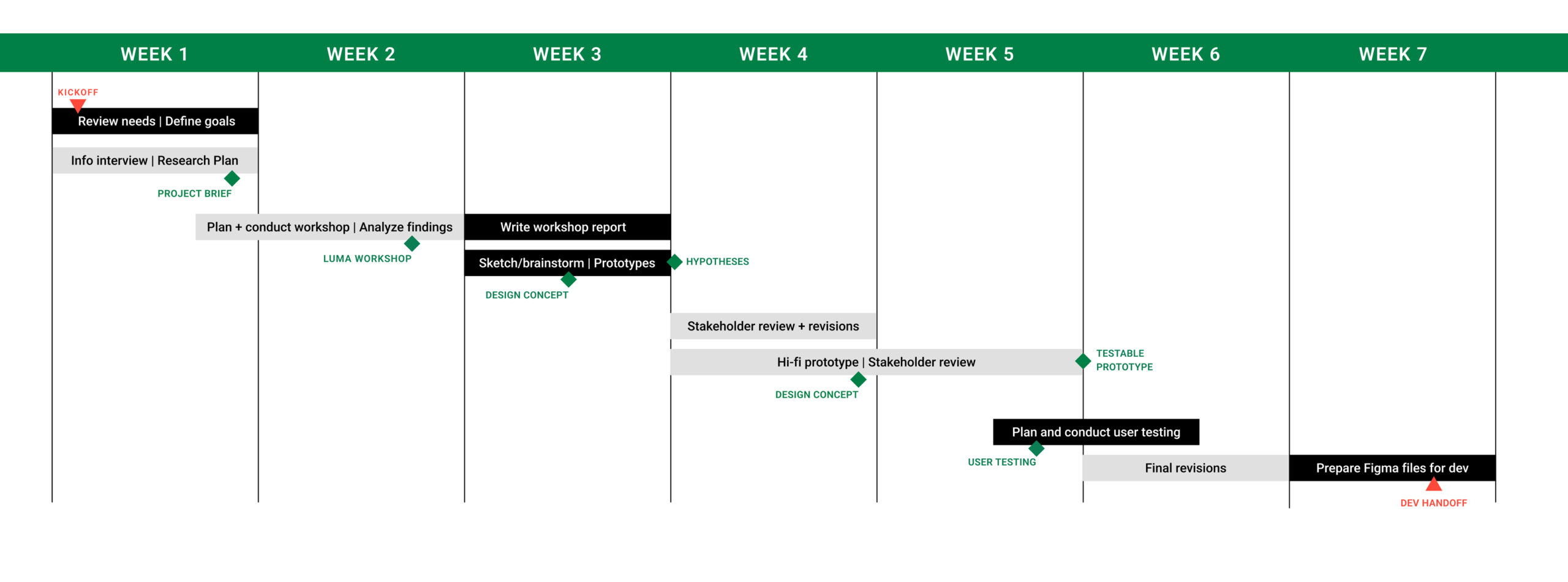
Every UX designer knows that a project schedule is merely a suggested time frame. There are many unforeseen circumstances that can affect it. This schedule was a bit ambitious and changed a few times mainly due to availability of attendees.
PRE-KICKOFF MEETING WITH STAKEHOLDER
I set up a pre-kickoff meeting with the stakeholder to better understand current goals and needs. This helped determine an approach for the deeper dive kickoff where I planned to conduct a virtual brain-storming/information-finding workshop with users.
During our meeting, I learned about the current corrective process:
- Audits start with on-site inspections at all retail stores
- If there are violations, they’re written up as audits. Issues of non-compliance fit within three levels of criticality: Critical, Major, and Minor
- The audit is emailed to Store Manager
- Store Managers log into third-party site to review audit and create corrective plan
- Corrective plans are emailed to the District Manager (DM) who either approves or requests revisions (also via email).
During our meeting the stakeholder emphasized a need for Store Managers to be alerted when there are issues to resolve. Also, that its important for a means of “back-and-forth” dialog between Store Managers and District Managers.
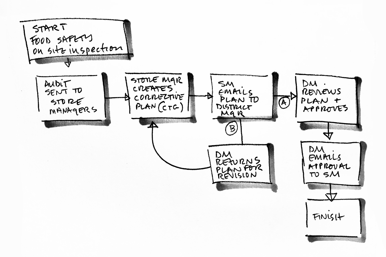
Here's the existing corrective plan process. It seemed pretty simple when I first sketched this flow…
PROBLEM STATEMENT
How might we make the process of Food Safety Assessment corrective planning easier and more intuitive for faster, successful completion?
INTERVIEW RESULTS LED TO THESE TWO QUESTIONS:
1. How might Yonderful help more women see that traveling alone can be safe, fulfilling, and relatively easy?
2. How might Yonderful encourage solo women travelers to venture outside of their own countries and away from tourist destinations?
INTERVIEW RESULTS LED TO THESE TWO QUESTIONS:
1. How might Yonderful help more women see that traveling alone can be safe, fulfilling, and relatively easy?
2. How might Yonderful encourage solo women travelers to venture outside of their own countries and away from tourist destinations?
MURAL/MIRO WORKSHOP
I planned to conduct a virtual workshop to encourage open discussion with users and stakeholders to understand current pain points and opportunities. This information influences decisions for functionality. I used the digital workspace, MURAL for workshop planning.
MURAL offers a variety of strategic templates for visual collaboration based on what you’re trying to learn and do. It works with Miro as a virtual white board so teams can collaborate remotely, which is how I conducted the workshop. Virtual activities are a great opportunity to level the playing field, ensuring everyone’s voice is heard.
I selected two MURAL exercises and then customized the coordinating Miro templates to ask what users considered to be positives, negatives and potential opportunities in the current process. Ideally, I wanted two hours or more to deep-dive, but due to limited user availability I had to do it in one. There were eight participants made up of retail store managers and district managers around the US.

MURAL and Miro are a great tool for facilitating virtual brainstorming workshops with users and stakeholders. I used them for the discovery research in my project.
WORKSHOP OBJECTIVES
The main goal was to design an app making the corrective process easier and more intuitive. But, what does “easier and more intuitive” mean? To find out, I made a list of simple topics to guide workshop participants.
- What is working?
- What is not working?
- What are areas of opportunities?
- Anything else as a “wild card”
I then assigned four categories within which users would apply the above questions. They were:
- Initiation of process
- During process
- Completion of process
- “Wild Card” for anything else
I chose two activities for user interaction; Rose, Bud, Thorn (RBT), and What's on Your Radar?
The first activity, Rose, Bud, Thorn, gets users to identify and align on issues within the categories of what’s working (Rose), what’s not (Thorn), and areas of opportunity (Bud). Color-coded stickies defined the topics by using pink (Rose), green (Bud), and blue (Thorn).
The second activity was What's on Your Radar? This activity prioritizes the issues discovered from RBT. Users place colored sticky note issues in priorities of lowest-to-highest (see below). The degree of priority diminishes as you move outward from the bullseye.
Note: I’m unable to show actual workshop exercises due to privacy issues.
UNPACKING THE ANSWERS
I expected fear to be the main reason for not traveling solo, but it wasn’t. Research revealed a variety of barriers to solo travel, including anxiety about the unknown, language barriers, not enough travel experience, being overwhelmed by the process, too many options, and loneliness. Some study participants said solo travel had never occurred to them as an option.
ROSE, BUD, THORN is good because it:
– Provokes conversation between users to identify pain points
– Invites divergent thinking
– Challenges assumptions
– Helps see different perspectives
– Invites divergent thinking
WHAT’S ON YOUR RADAR? is good because it:
– Prioritizes issues
– Validates assumptions
– Validates use cases
– Helps define personas
Rose, Bud, Thorn Exercise
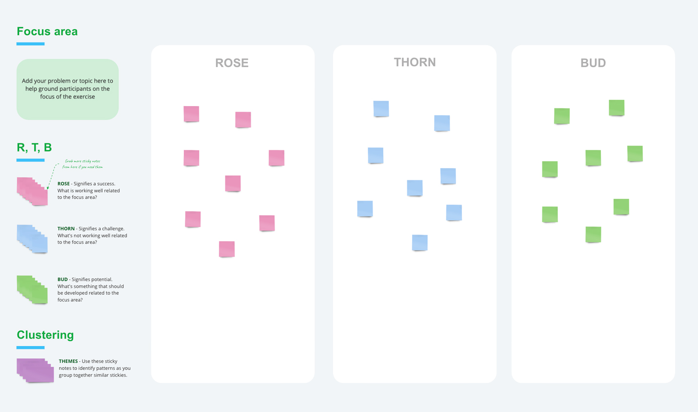
What’s on Your Radar Exercise
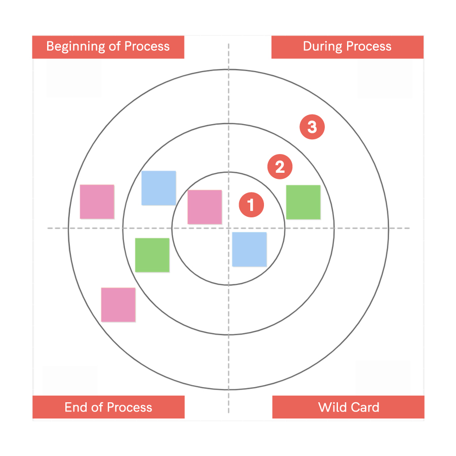
(Left) Rose, Thorn, Bud diagram.
Participant write issues on stickies with colors representing positives (pink/rose), negatives (blue/thorn) and opportunities (green/bud) of a given category/topic. I added a fourth “wild-card” category to cover anything else.
(Right) What’s On Your Radar? diagram. Users place sticky notes from Rose, Bud, Thorn exercise in the circles of the radar diagram.
The most central circle (1) represents the highest priority. The middle ring (2) represents medium priority, and the outermost ring (3) represents lowest priority.
“The current system is boring, straight out of the 90’s.”
“Most of the time when traveling, plan B is better than plan A.”
“Most of the time when traveling, plan B is better than plan A.”
“Most of the time when traveling, plan B is better than plan A.”
— WORKSHOP PARTICIPANT
— COLLEEN C.
WHO IS OUR USER?
Users for this app were already defined by the stakeholder as District Managers and Store Managers. With this in mind, I created the personas below that give an overview of the needs, behaviors and pain points for each. These personas will be valuable for use on other S4 app designs in the future where either are the users.
WHO IS MY AUDIENCE?
Yonderful’s target audience is female-identified people who want to travel solo but for whatever reason have not. They’re open to the idea of traveling solo and want to experience travel through a lens outside of the usual tourist destinations. They are culturally curious.
I interviewed six women living in the US, Canada, Mexico and Egypt to learn about their travel experiences, and any motivating or hindering factors.
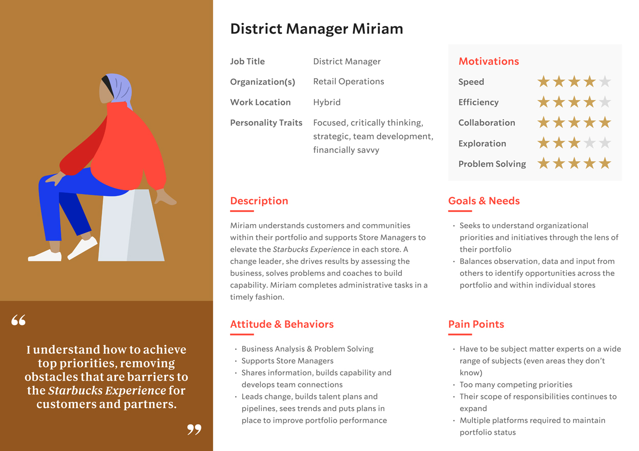
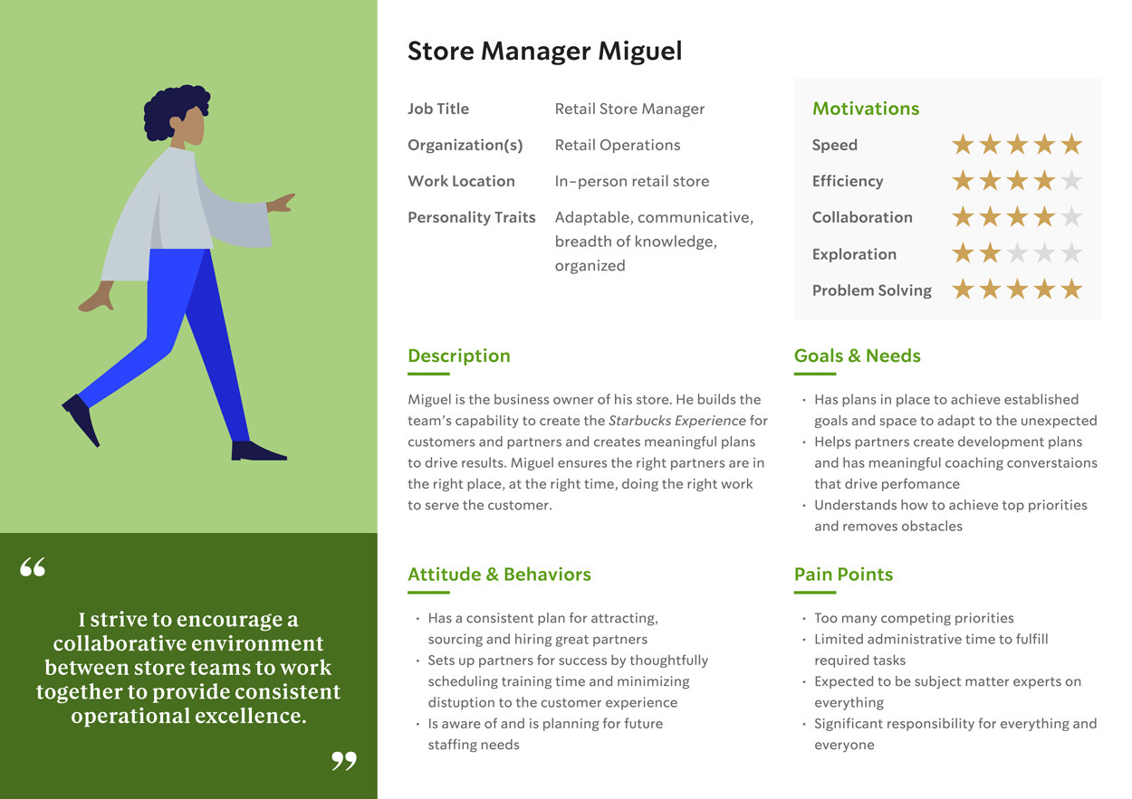
These are the two personas I created to add to our team's persona library; District Manager and Store Manager.
WORKSHOP FINDINGS
Before the workshop I assumed the basic functionality of this project would be relatively simple. However, after the workshop, user needs inspired a variety of opportunities which led to expanding opportunities of functionality.
Users said they liked some aspects of the existing process: that audit issues are digital and accessible, and that the very act of developing a corrective plan leads to committments and accountability for plan completion. What they didn't like was that the site was difficult to log into, and the amount of information was too wordy, required excessive clicking through, and required many steps just to access. They wanted transparency between SMs and DMs, to be more partner friendly.
“That was kinda fun!”
“I knew I wanted to take a long-term fine art course, and then I looked for locations.”
— WORKSHOP PARTICIPANT
— TULASI
Below is a detailed itemization of what I discovered, broken into stages of the corrective planning process.
1. BEGINNING OF PROCESS
Users don't like:
- Look of interface (It's boring)
- Difficult for DMs to find submitted plans
- If DMs don't check every line item for approval, it looks as if nothing is approved
- Not formatted for quick reading (ie: Wall of text)
Users want:
- Easier way to access info (ie: direct links to reports, etc.)
- Designating a follow-up date
- Method to delegate plans to partners via drop-down or pre-loaded method
- Use of visuals to help cognition (ie: icons)
2. DURING PROCESS
Users like:
- Actions needed by SM are clear
Users don't like:
- When plan is past due, SM plan is not linked
- SM uses plan as a checklist instead of a sustainable action
Users want:
- More specific solution expectation
- Ability for SMs to delegate responsibilites and educate on how (training)
- Links to previous assessments to validated, previous opportunities that have been addressed and not recurring
- Corrective action to address who, what, why to support the coaching model (per training)
- Ability to tag support teams
- Recognition for clean and safe environment, ie: Food Safety Rock Stars
- Links to tools (resources)
“It’s reassuring to know that others in this workshop feel the same way as I do!”
– WORKSHOP PARTICIPANT
STEP 3: APPROVAL PROCESS
Users like:
- SMs get three reminders leading up to “Late” status
- DMs get an email alert when there is a plan to approve
Users don’t like:
- DMs don't get confirmation about a successfully approved plan
- Reports get lost or forgotten due to other priorities
- Although there are reminders, they are not consistent enough or reaching their audience
Users want:
- To provide alert dates to SMs and DMs
- Pop-up alerts in email to trigger revisit of plan
- Follow-up reminder emails after approval date is passed
- 30-60-90 day reminders until completion
- Due dates linked into SMs and DMs calendars
5. POST APPROVAL
Users don't like
- No way for follow-up once plan is completed
- SMs and DMs rarely revisit after a plan is done
OPPORTUNITIES THAT EMERGED
Training
- Links to video resources and/or links to violations
- Add a page for training and resources (PDFs and videos)
Functionality and Interaction
- Ability to highlight top 3 critical items to observe in store
- Ability to interact with occassional tertiary partners (ie: facilities) when necessary
- Standardize action plans by compiling common successful, solutions into a “most common” library/archive along with suggested timelines
Alerts
- Once a plan is in action, incorporate a method of alert to indicate whose turn it is, that action is needed, that there is a report waiting, etc.
- When audit results (from third party) auto-trigger a release of a portal directed at relevant parties prompting them to submit a plan (SM) or approve a plan (DM)
Affinity Diagram
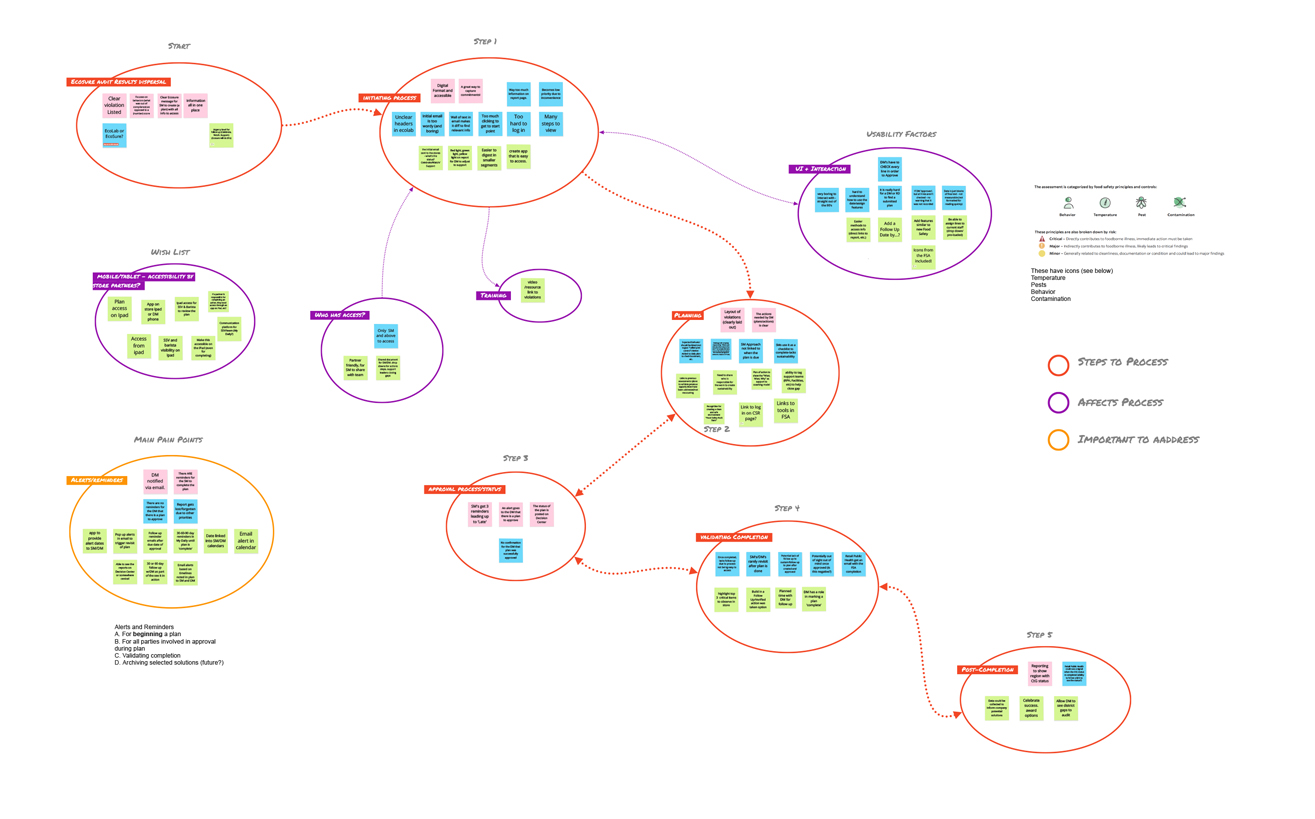
To save valuable time for use on discovery during workshop, I waited until after the workshop to create an affinity diagram from the findings.
The categories that naturally materialized were:
- Process steps
- Aspects affecting process
- Other important aspects
Using the patterns found in the Affinity diagram, I created a user flow to develop a first pass at functionality.
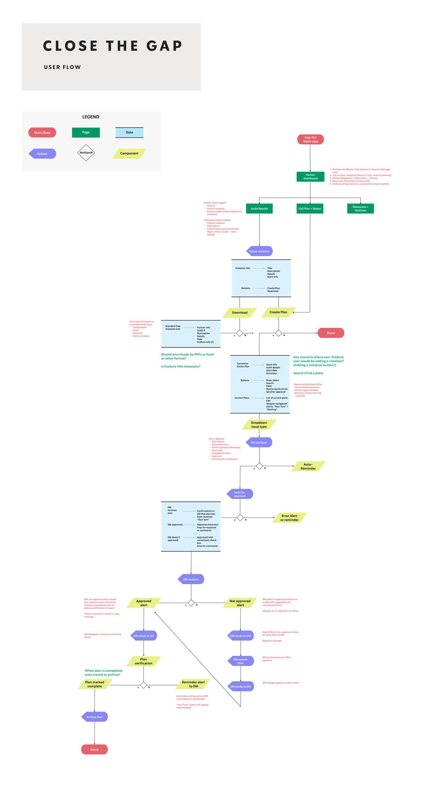
This flow diagram shows the journey of a user through various options of the app. However, I had to go back to show how the user received the audit reports in the first place.
Click the button below to see diagram in a larger size.
After presenting this to our team for feedback, I realized I needed a 50 ft view instead 1000 ft. How will users get the information from the third party? Here’s another pass at the user flow to explain this.
Because this process will no longer be using the third party after the initial Food Safety assessment, the audit results need to flow into Starbucks S4 data lake. This is a not new for S4, so we can expect that audits will automatically load depending on permissions of the partner who logs in.
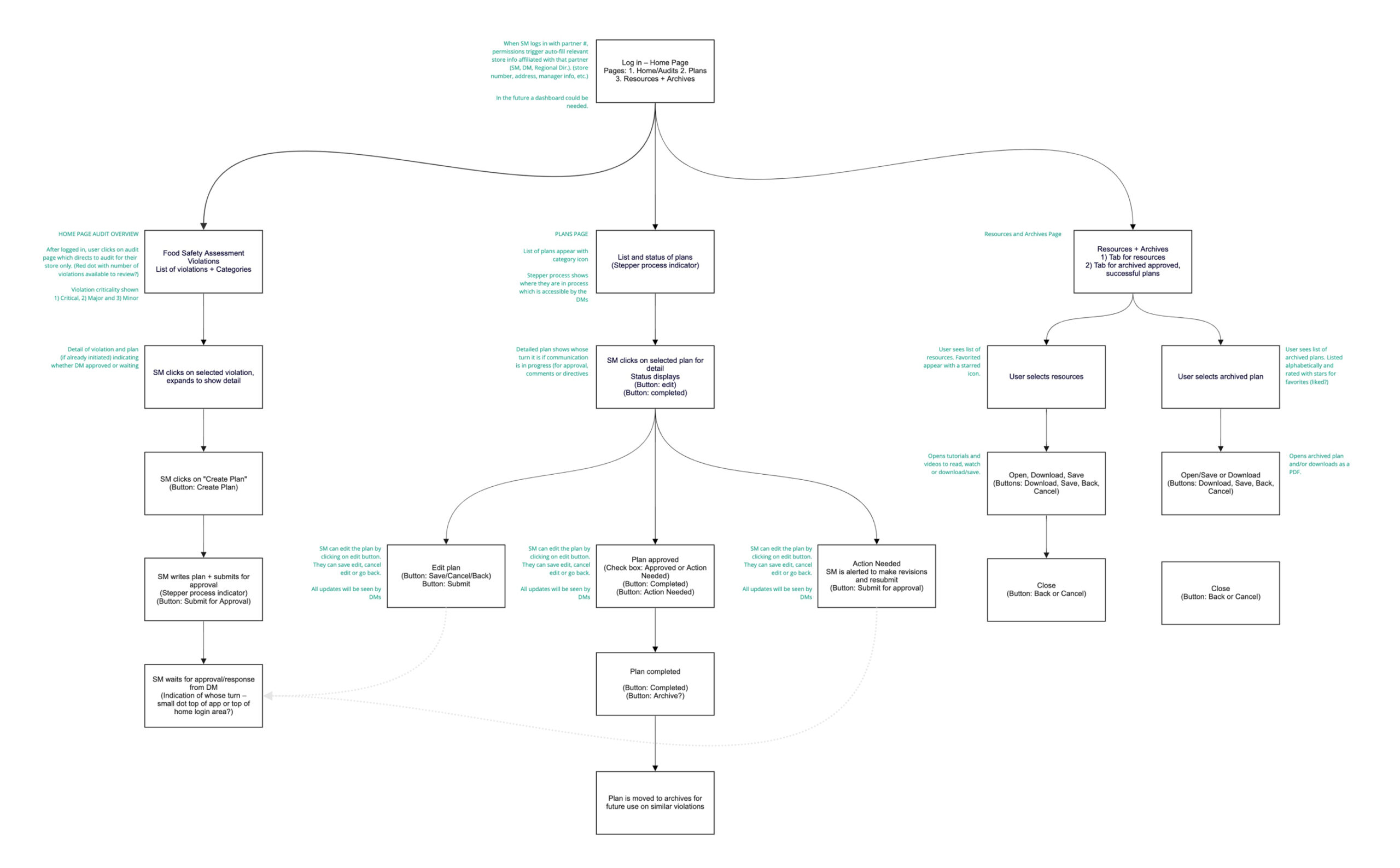
The second flow wireframe explains functionality post log-in.
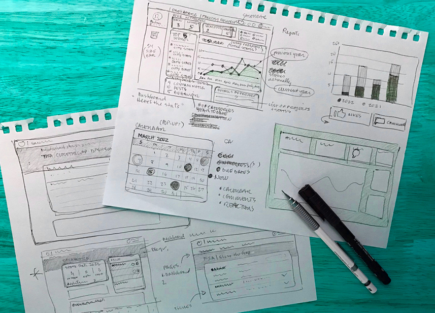
PULLING ON A THREAD
For a problem that seemed straightforward, it was becoming complex. Issues that surfaced during the workshop created solutions that required visualization for connecting the pieces. The following images show variations of a few viable designs that I presented to the stakeholder.
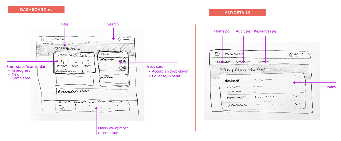
NAVIGATING THE NAVIGATION
When designing the navigation, I initially hypothesized that location should inform the site structure. However, after running a card sorting exercise revealed that users have an activity in mind and then find a location to do it.
NAVIGATING THE NAVIGATION
When designing the navigation, I initially hypothesized that location should inform the site structure. However, after running a card sorting exercise revealed that users have an activity in mind and then find a location to do it.
NAVIGATING THE NAVIGATION
When designing the navigation, I initially hypothesized that location should inform the site structure. However, after running a card sorting exercise revealed that users have an activity in mind and then find a location to do it.
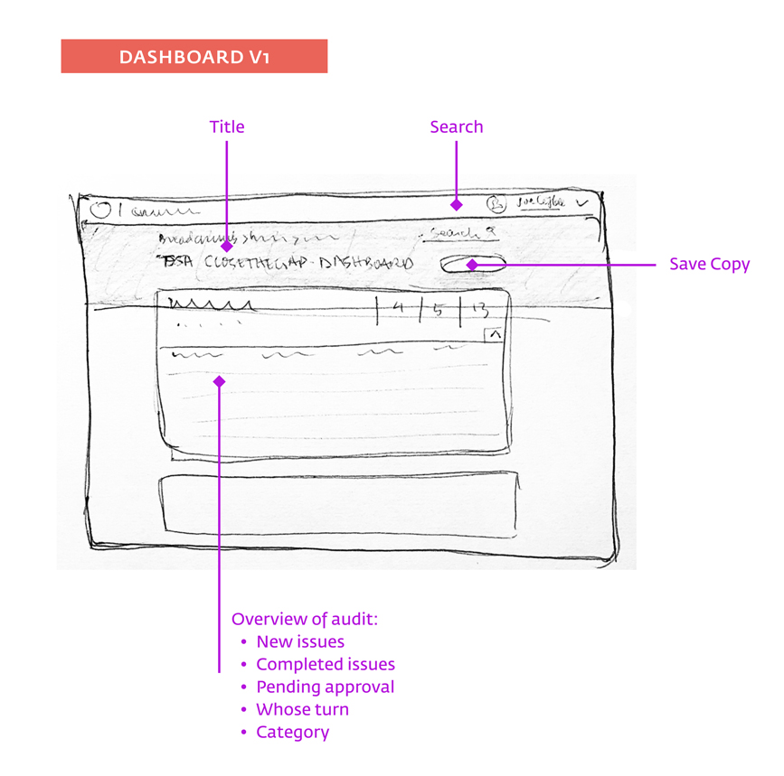
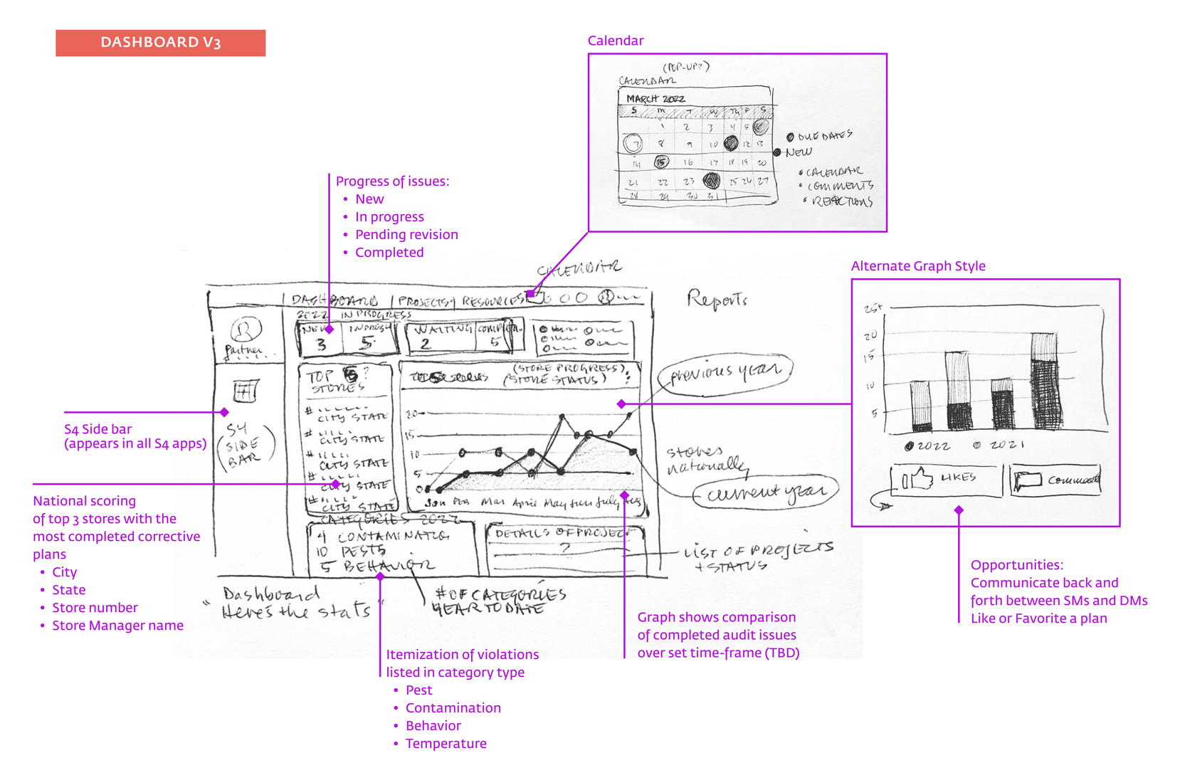
These three dashboard variations acted as a starting point for resolving many of the pain points expressed by users in the workshop.
ADDING DETAILS
The previous sketches helped focus on functionality to resolve pain points uncovered through the workshop. Each idea led to more complex solutions. This was the divergent phase of the design and resulted in the following ideas with variations emphasizing different aspects.
YOUR PERSONAL TRAVEL GUIDE
To build users’ sense of safety and curiosity, “My Journal,” a customizable archive of user-generated content, gives users access to details throughout all phases of travel – before, during and after. Yonderful community members can organize and filter by location, time, even, share photos, set reminders and more.
While planning a trip, users can save dates, itineraries, hotel, transportation and other booking information. During travel they can access and share hotel information, confirmations, phone numbers, emergency information, and add photos to social media. After the trip they can store contact information, add reminders, share information. They can also write about their activities and locations on the main site as well. Users can share information and access on their calendar or maps.
Several study participants said that if a role model or friend traveled solo before them, it would reduce their anxiety. “My Journal” allows users to build a community of solo travelers. Through this community, women are supported by having direct access to other women’s experiences and travel advice. My hypothesis was that women will be more willing to travel solo with the encouragement of virtual travel friends.
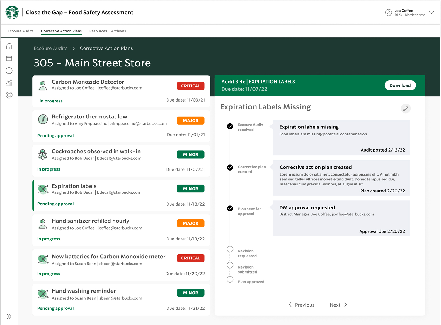
V1 with slide-in filter
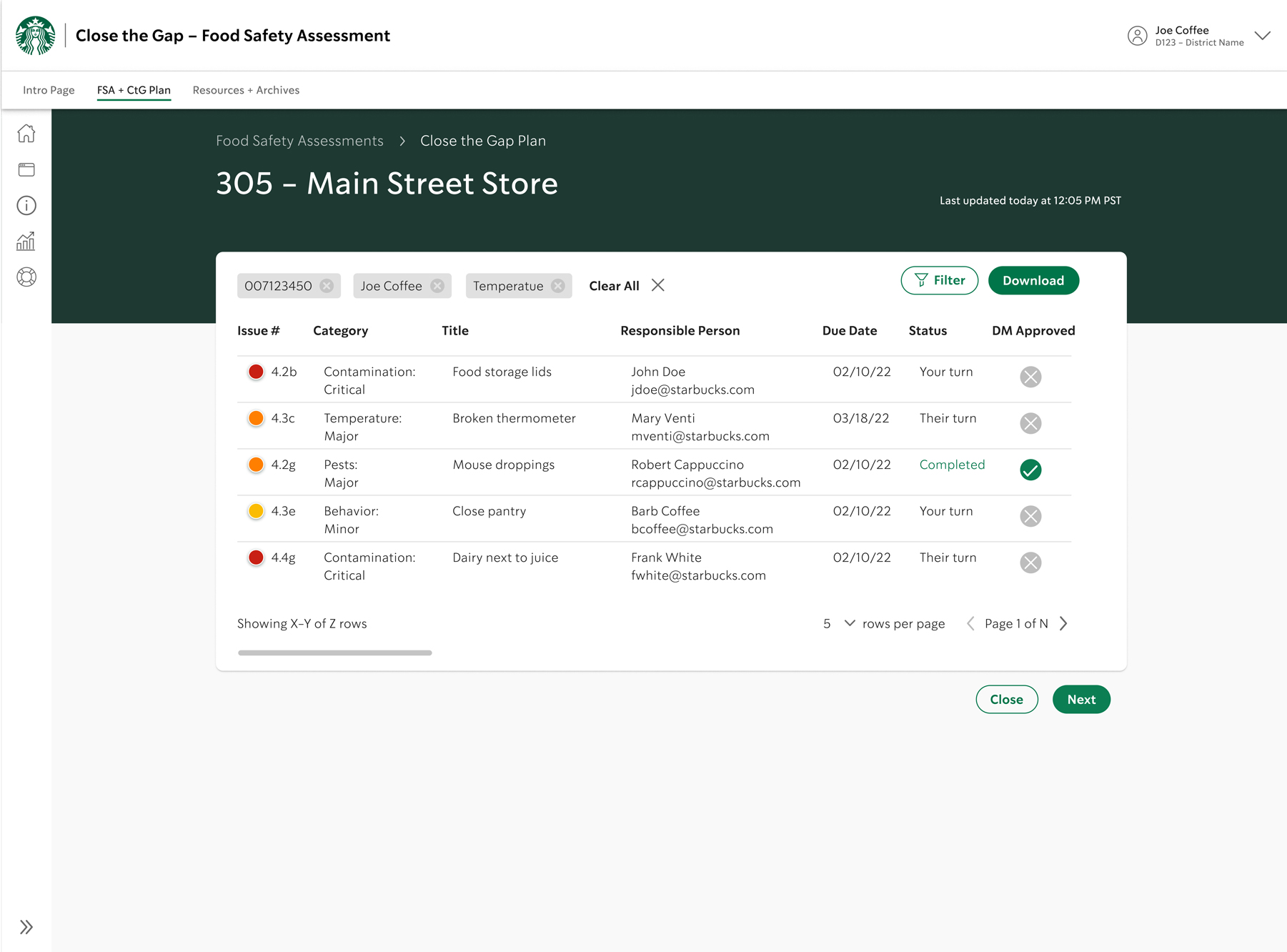
• Log-in triggers automatic store info and permissions of user
• Page opens to overview of most recent list of violations
• Each violation indicates criticality and category
• Indication of whose turn for action
• Partner and email of plan owner
• Once a plan is approved by DM, green checkmark appears
• User clicks on violation row to open full details on separate page
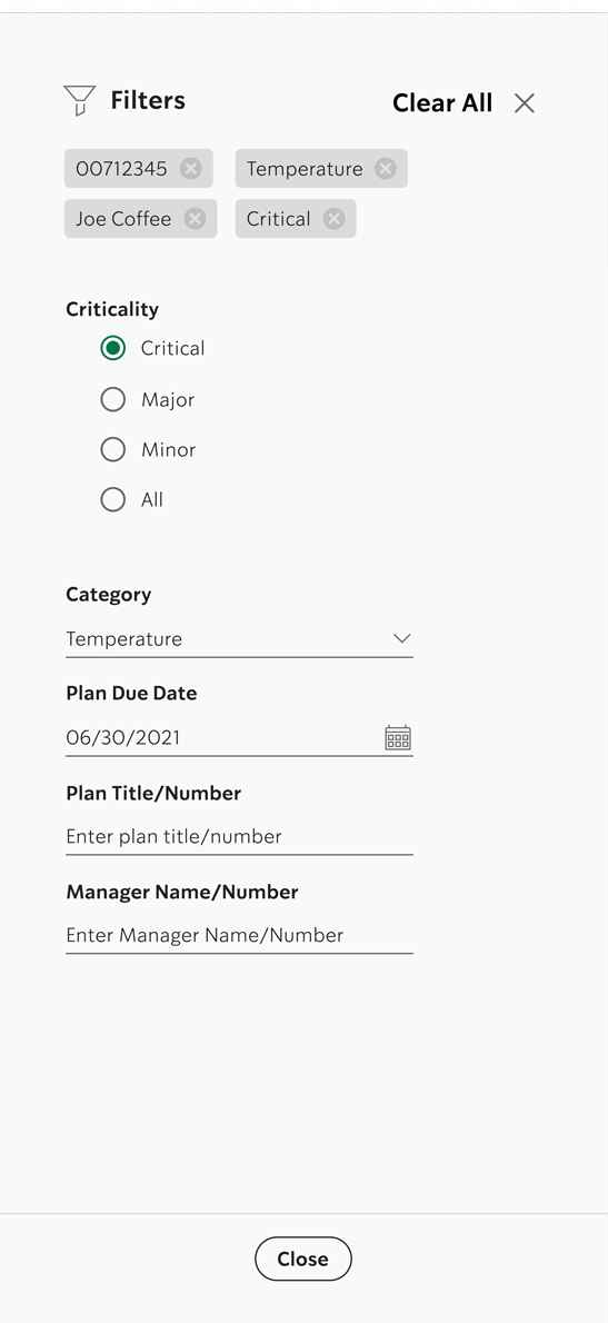
SLIDE-IN FILTER
• User clicks on button to engage filters
• Ability to filter query results by: archived and/or completed, category, number, title, due date, etc.
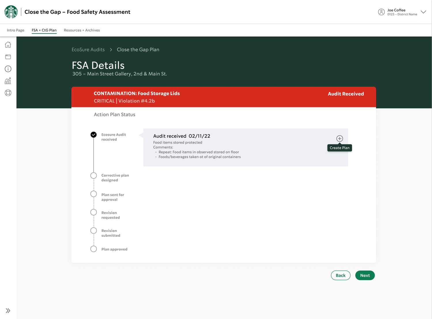
V2a Audit plan details
V2b Drop-down plans per criticality
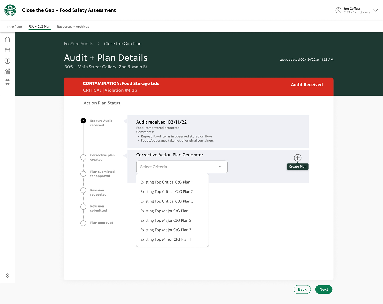
AUDIT PLANS + DETAILS
• When user selects audit from list it opens detail status page
• Allows plan to be created
• User can see where they are in process
• Shared info with DM
• User clicks on the “+” symbol to create a new plan
• “+” symbol turns into an edit pencil icon after plan commences
• This page takes user to a drop-down with top three corrective actions for critical, major and minor categories, plus option to create a custom plan
CORRECTIVE ACTION DETAIL (AUTO DROP DOWN LIST)
• When user selects audit from list, it opens process details page
• User see where they are in process
• Shared info with DM
• User clicks on “+” symbol to create a new plan
• “+” symbol turns into an edit pencil icon after plan is started
• When there are enough completed corrective plans option for drop-down under each four categories offering top three solutions for each, plus “other” to input anomalous issues.
DROP-DOWN
• Auto-filters based on the audit numbers associated (ie: 4.1, 3.2, 2.2, relate to main categories)
• Contains top 3 critical, major, and minor.
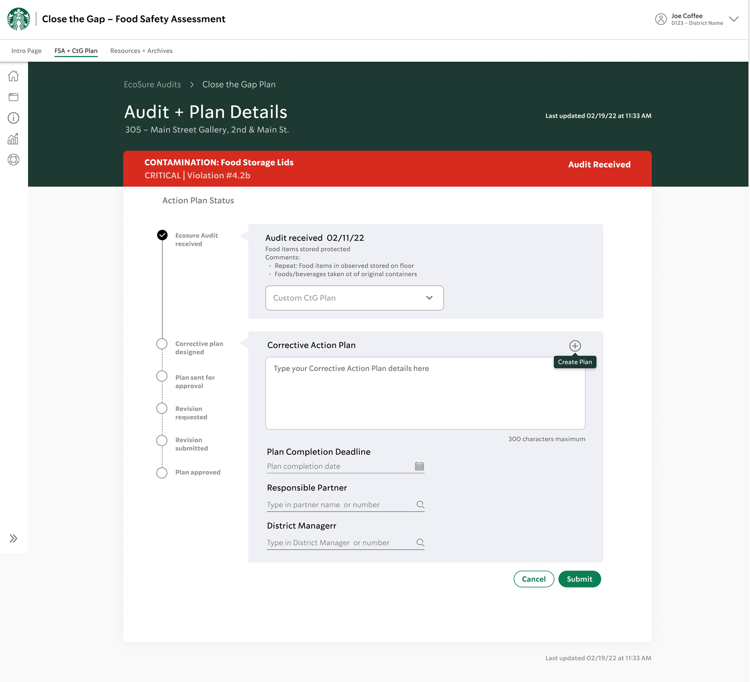
V2c Create custom plan
V2d Completed example
PLAN COMPLETION (NEW CUSTOM PLAN)
• User can click on the + sign to create a custome plan not on the list of common corrective actions. A text field is available allowing limit of text
• Date picker pops up when user clicks on date to select dates for: plan initiation, approval deadlines, completion dates, etc.
• Possible idea to trigger an alert to the party whose turn it is for action?
FILLED IN EXAMPLE
• Back button will go on lower left
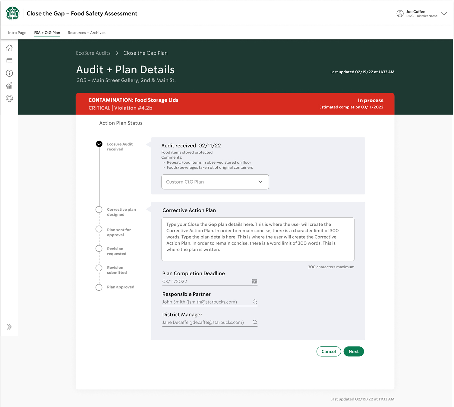
V2e Continue process
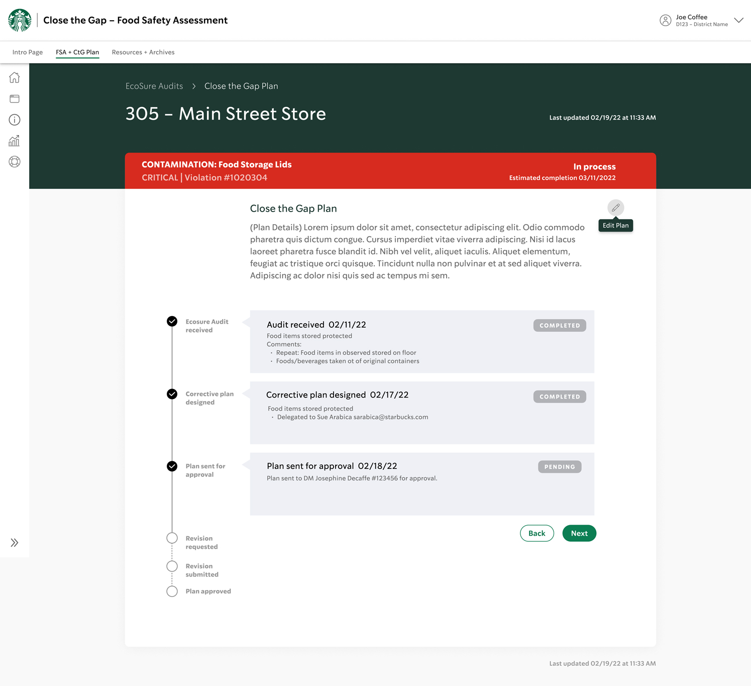
V3 List and process on same page
CONTINUE THROUGH PROMPTS
• User continues through the vertical stepper prompts
VERSION 3 – LIST AND PROCESS SAME PAGE
• Upon log in, user sees store violations organized by criticality
• Category icons appear on the left
• Active selection is identified by a green edge
• Due dates are listed on lower right
• When user selects a violation, details open up with a vertical stepper navigation to prompt user through to end
V4 Option for DM's regional dashboard
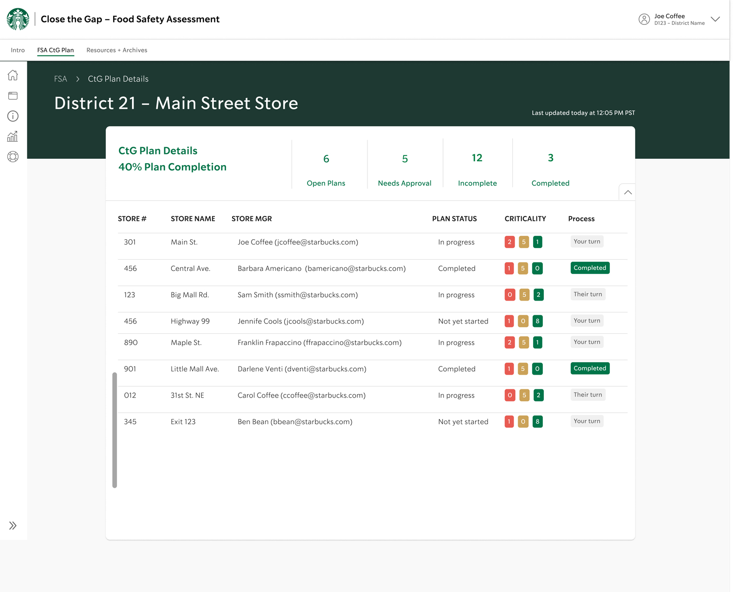
REGIONAL STATUS FOR DMs
This is an option for DMs to see a collective view of their regional stores’ plan progress
PAIN POINTS ADDRESSED
• Communication transparency between Store Managers and District Managers is resolved through their ability to see the plan status of each issue. This also alleviates the need for back-and-forth emails which risk getting buried.
• Auto-drop-down menu of top three common solutions for each criticality prevent users from spelling errors and incomplete information as well as saves time.
• Visual cues through the use of icons and colors help users prioritize the most important issues.
• An alert system helps users stay on top of deadlines and let’s users know whose turn it is. Auto-alert when due date is reached.
• Information stored in data lake is auto-populated on log-in page which saves time and prevents errors.
• A collection of successful, corrective actions will become a library used for future, similar violations. This saves time and prevents errors.
USER FEEDBACK
High-level summary of responses to the Yonderful prototype site:
• The sub-navigation is daunting and should be simplified.
• Having an international audience, icons simplify the site for non- English speakers.
• Users like the destination recommendations on the home page because they give them ideas that they wouldn’t otherwise have considered.
• Users like the cultural activity recommendations too. They said Yonderful inspired them to check out new activities and places and has potential as an actual product.
• Users loved “My Journal.” They liked suggestions from people they might potentially meet while traveling and suggested adding filter functionality for names, dates, where met, etc.
CONCLUSION
Although my contract with Starbucks ended before I could see this project through to being live, I left it in a state that accomplished the original goal and more. The stakeholder really liked where I was headed with the options and appreciated my thoughtful consideration to all of the pain points and wish lists.
He especially liked my ideas for future features and functionality in terms of supporting collaboration between all partners. The idea of building archives for standardizing corrective actions will make it easy for partners to quickly resolve store violations – the less time a store has food safety issue, the less chance for customers to be affected and the less chance for legal actions against Starbucks. A win for everyone involved!
CAN I GET A REDO?
At the end of this project, I discovered things I wish I’d done differently.
• I’d conduct interviews with respondents covering a wider age range.
• I didn’t think to factor in that when you live outside of your home countries by your own choice, you're already more adventurous than most by that fact alone. I need to interview people who live in their own country.
• A beginner traveler needs more information and advice than an expert. Therefore, icons for levels of expertise indicating beginner, intermediate and advanced would be helpful.
• Instead of showing the entire detailed list on the contextual navigation, I would reduce visual overload with a drop-down menu for each sub-category.
“Many designers say they think empathetically, but you really do — it’s obvious through your designs that you genuinely care about the user.”
“Stop saying ‘I wish I could,’ and just go.”
“Stop saying ‘I wish I could,’ and just go.”
“Stop saying ‘I wish I could,’ and just go.”
– FELLOW S4 DESIGNER
NEXT PROJECT
NEXT PROJECT